Marketing

Report Card: F/W ’17 Ad Campaigns

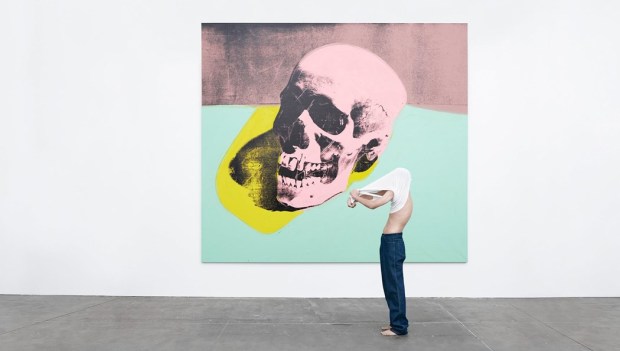
1201454.jpgRaf Simons’s first Calvin Klein ad is a perfect mission statement for a new era.

This season’s spate of advertisements is, largely, absolutely fantastic. So fantastic, in fact, I went back and forth about including an exclamation point in this paragraph, but decided not to deploy one for reasons of self respect. The quality label-ambassador pairings we see this season perhaps reflect a deep thoughtfulness about brand identity in a time of industry upheaval—communicating a brand’s meaning is more important than ever when designers are playing musical chairs and consumers are saturated with digital media. Here are some of the high achievers.

Jude Law for Prada

prada-ss17-campaign_2-2-1024x593

I love this. I love this so much that I would wallpaper my apartment with it, regardless of my deeply held opinion that Jude Law is the platonic ideal of human beauty. This minimal shoot by Willy Vanderperre nails the essence of Prada: practical, intellectual, and offbeat. Law lounges contemplatively amongst sand dunes in an array of unfussy and tailored shirts, pants, and even sandals (my rule about men in sandals—that it should never, ever occur unless one is an Olympic swimmer or any other type of water sports professional— is null and void when it comes to Prada, they of ugly-chic splendor). Law, despite actually being the most handsome man in the world, is the perfect choice for Prada, as both actor and brand are at interesting stages of their lives.

Law, now in his mid-40s, is taking a variety of unusual and supporting roles, rather than the typical leading man parts, including in Anna Karenena, The Grand Budapest Hotel, and Genius. At his Times Talk last June, he spoke to this shift as being both more natural than calculated and that collaborating with interesting directors is his main criterion when considering roles. So too, is Prada at a moment of transition. No longer the ‘it’ brand of the moment, Prada is reconnoitering the rapidly-evolving fashion landscape quietly, and perhaps in a reactionary way. Miuccia is carefully observing and pointedly not participating in the conversation around the turbulence of the designer revolving door, see-now-buy-now, and co-ed clothes, which, in a way, is reflective as the label’s status as a true luxury brand — not having to cater or pander to anyone or any trend in particular. She continues to produce quiet, sophisticated, and interesting clothing, almost as if to please herself. She will make large changes to brand strategy when she’s good and ready, but not before a great deal of consideration.

This collaboration is sublime; an alignment of artistic renaissances. and making old favorites current ones.

Grade: A

Charlotte Rampling for Loewe

This is a magnificent pairing — the most unusual and enigmatic actress of the twentieth century posing for Loewe, a recently-revived Spanish luxury label helmed by wunderkind Northern Irish Jonathan Anderson, known for his interesting silhouettes, proportion play, and gender-bending designs. Anderson is himself somewhat inscrutable, and his designs mercurial — some more intellectual, others more commercial — and entirely avoidant of the celebrity PR circuit — one rarely seen his clothes on a red carpet, and when one does, they’re on fellow sublime weirdo Tilda Swinton. Rampling, exceedingly private and dismissive of Hollywood, is the perfect face for the brand; a real meeting of the minds between designer and muse. I only wish this Jamie Hawkesworth-shot series was more visually engaging, and more suggestive of a narrative — a more fleshed-out setting would do the trick. The dark palette, too, makes it easy to visually skip over if one doesn’t have Rampling radar. Perfect casting, unremarkable execution.

Grade: B+

Art for Calvin Klein
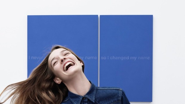
1201453.jpg

Raf Simons loves contemporary art. As demonstrated in the excellent yet ungrammatically titled documentary Dior and I, he frequently visits museums and galleries in search of inspiration, and has both collaborated with and referenced the artist Sterling Ruby while at Dior, and in his eponymous menswear line. I was curious to see what the first Calvin Klein ads would look like under Raf — he’s not one for cozying up to celebrities in his personal life or casting them in ads unless contractually obligated, yet Calvin Klein is, historically, a celebrity-driven brand, particularly in its advertising.

Instead of famous people, Simons cannily casts art by Andy Warhol, Richard Prince, and his bff Sterling Ruby in starring roles in the Willy Vandeperre-shot campaign, letting the paintings and their artists take center stage. Still, he plays with Calvin Klein tropes of denim, underwear, and young couples, giving them subtle, modern updates; the result is a little cleaner and a little more European. With the fun and accessible choices of art and the classic branding motifs, Raf acknowledges the label’s pop-cultural roots, but reframes them in a restrained way that is much more ‘him.’ This is a great first ad campaign under the new rule. I am so excited to see what’s to come, and how art will factor in in both the clothing and the advertising. Basically I hope this becomes an empire of Jil Sander.

Grade: A+


State of the Art: When Stella Met Ruscha

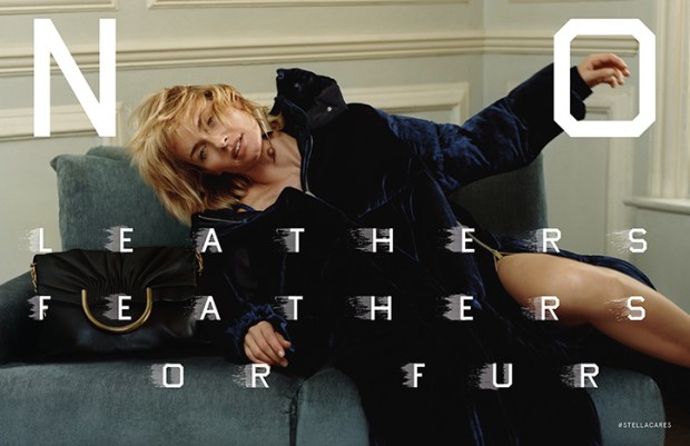
Ed_Ruscha_for_Stella_McCartney_Stellacares_fashion_editorial_Harley_Weir_Winter_2016.jpgStella McCartney’s F/W 2016 Campaign

This season, Stella McCartney teamed up with legendary artist Ed Ruscha on her Fall 2016 ad campaign. Shot by Harley Weir and starring Amber Valetta, the ads showcase the label’s core tenant of cruelty-free fashion, with Ruscha’s unmistakable typeface spelling out “No Leather, Feathers, or Fur,” “Veg Out,” and “Meat Free” across the images. This brilliant collaboration sets McCartney apart from her luxury rivals and lower-tier imitators as the undisputed queen of “vegetarian” fashion, and gives her heavyweight artistic credibility, when her famous friends and celebrity clients can sometimes overshadow her importance as a designer and fashion innovator. The campaign is also an unprecedented project between designer and artist that spawns a new chapter in the fashion-as-art debate: can fashion advertisements be art?

The collaboration was born when Ed Ruscha and Stella McCartney appeared together on an episode of Sundance’s Iconoclasts. The two are very different at first glance: Ruscha is a 79-year old Oklahoma-born American Artist whose text-centric art routinely passes through the doors of major auction houses, and is synonymous with a wry west coast cool; while McCartney is a British fashion designer forging a Kering-backed empire of sustainable fashion, and spawn and pal of celebrity. But the two come together seamlessly on the desire to communicate a large, important idea in a pithy and accessible way. Stella has the message, and Ruscha has the medium.

Fashion label-contemporary artist collaborations are nothing new, and the list of ventures is long and varied. Typically, however, we see artist collaborate on the design of a piece of apparel or accessory –  like Takashi Murakami, Richard Prince, and Stephen Sprouse for Louis Vuitton; Sterling Ruby for Raf Simons and Dior; and, most recently, Alex Katz for H&M. This territory is not new for Stella McCartney, who collaborated with Jeff Koons on rabbit pendants in the mid-2000s, which are now going for a pretty penny at auction.

The McCartney-Ruscha partnership, however, as an ad campaign, is a different animal. The closest thing to this kind of collaboration was when David Lynch photographed a campaign for Christian Louboutin in 2008. No other major artist has engaged in the advertising process so explicitly, and so adjacently to his own canon: the McCartney collaboration is an interesting extension of Ruscha’s work as a pop artist, and as an artist concerned with consumer culture, Hollywood, and, in fact, advertising itself.

McCartney’s label was one of the first ‘environmentally friendly’ labels when it was founded in 2001, eschewing the use of leather, fur, and feathers, and promoting organically grown fibers and sustainable fashion. Today, that message tends to be overlooked, and Stella McCartney is seen only as a British luxury label favored by celebrities and Team GB. With sustainability becoming a much-discussed topic and high priority within the fashion community, now is the perfect time for McCartney to remind the fashion world and its consumers of her pioneering status in the field and capitalize on the industry’s priority shift. The best way to remind conscious buyers of the brand’s tenants is visually, which is where the collaboration with Ruscha comes in. Ruscha’s paintings typically feature a word or phrase in a signature blocky font. His deadpan works frequently play on the tension between the opaque and the obvious, and modern life and nature, as many of the words are set against a landscape.

In the McCartney ads, however, the message is nothing but clear and not in the least ironic – Ruscha spells out the line’s ethos and reminds viewers of the label’s status as the only “vegetarian” luxury brand. This explicit visual reminder does wonders for repositioning McCartney as a model for companies seeking to create ethical fashion, and as the crown jewel in the Kering stable in terms of sustainability, which is one of the conglomerate’s biggest corporate goals. It also lends the label gravity and serious artistic credibility, and situates it as unique among labels as a pioneer in the advertisements-as-art field. This is also an interesting opportunity for Ruscha, allowing him to play in the advertising medium for a worthy but ultimately commercial cause, instead of lending tongue-in-cheek critique of consumerism from ultra-expensive paintings.

I’m of the opinion that fashion advertisements are art. They’re a perfect distillation of a brand’s meaning in a few photographs, and thus often more narratively full and than an editorial photograph. The McCartney-Ruscha partnership is the first of its kind, and I imagine an important milestone in positioning advertisements in a more artistic, and less commercial, light. I hope to see more to come – how about Tracy Emin for Gucci?


Bullseye: Victoria Beckham’s On-Point Collaborations

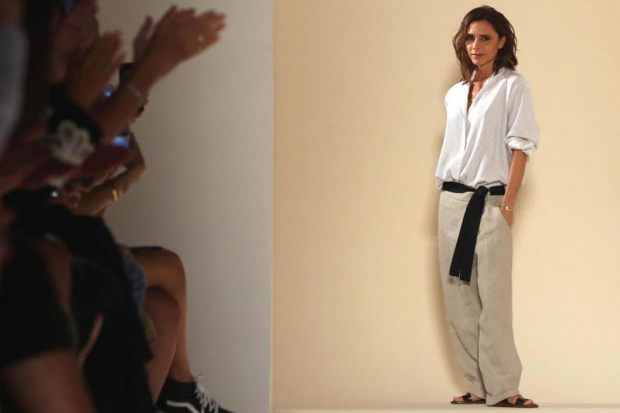
unnamed-2.jpgBeckham has chosen two perfect collaborators for her expanding empire.
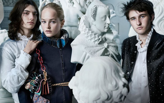
Last month, Victoria Beckham announced a partnership with Target on a limited-edition capsule collection. Composed of apparel and accessories for women and children, the collection will debut in April 2017, and is a brilliant move on behalf of Ms. Beckham, who also has a newly-minted cosmetics deal with Estée Lauder. These selective, on-brand collaborations will set Beckham up for long-term success, and simultaneously lend the ventures more credibility than if she were to launch additional sub-labels under her own brand – if she’s able to keep them both accessible to an entry-level buyer.


The Beckham-Target union is fantastic for both entities. It’s such a good fit for both brands, and it’s certainly the most exciting PR either party has received lately. Beckham has been struggling with her eponymous business in the last couple of years, due to a lack of standout pieces and a general consumer unwillingness to pay ultra-high prices, and needs a new product and price point without diluting her label. Enter Target.


Target, the upscale yet ultra-accessible American retailer, is the perfect place for Beckham to launch her latest venture. They have a history of successful high-fashion design collaborations – Proenza Schouler (2007), Rodarte (2009, from which I still wear a dress), Missoni (2011, which famously crashed their site), Jason Wu (2012), Phillip Lim (2013), Peter Pilotto (2014), and Altazurra (2014) – and have a great formula for creating an absolutely vicious feeding frenzy around the limited-edition capsule collections.

Target’s latest designer collaborations, with Lily Pulitzer (2015) and Marimekko (2016), especially, were met with a collective huh? and sluggish sales – honestly, who thought Lily Pulitzer was a good idea? – but Beckham’s line, which will be composed of apparel and accessories for women and children, will be explosive both because of the content and its famous designer.


Beckham is aspirational – wife, mother, multi-hyphenate career woman, cultural icon– and makes clothes that both fashion and non-fashion women alike will want to wear: flattering, simply-cut dresses, pencil skirts, structured bags, and classic, oversized sunglasses. She is also a hands-on mum to four very cute kids with her handsome, superstar husband, making her an ideal candidate to design functional yet stylish childrenswear (anyone who birthed Romeo, my much-documented favorite child in all of Hollywood, and the very cute and precocious Harper, I trust completely with all aspects of child rearing.)


Partnering with Target for a lower-priced line, and especially for childrenswear, is a better course of action than trying to incorporate them into her label, which already has a lower (ha) price sub-label, Victoria Victoria Beckham. They will be much more accessible to American shoppers that way, and won’t be siloed only among the fashion crowd, in the way that Stella McCartney’s childrenswear is. And an in-house sub-label at fast-fashion prices would hurt her overall brand if not distributed in collaboration with a reputable yet accessible third party like Target.


So good and accessible in fact, is Beckham’s simple, fashion-forward aesthetic and so aspirational is her lifestyle to women, especially mothers, that I think the she could be hugely successful in a long-term partnership with Target, à la Isaac Mizrahi. She is more suited to this kind of partnership than any other Target collaborator because of her mainstream celebrity, unlike Pilotto or Altazurra, who would only be recognizable to the fashion set. I wouldn’t imagine that this kind of high-low partnership with would threaten to dilute Beckham’s high-end line because of the difference in price and quality – women buying thousand-pound Victoria Beckham pieces aren’t going to stop buying those pieces because plebs can now get items by the same designer in Target; the two ventures are very different animals for two very different audiences.


Beckham’s partnership with Estée Lauder is also a mutually beneficial endeavor. As the most established cosmetics brand, working with Estée Lauder automatically legitimizes the quality of Beckham’s product, a range of pretty pinks, soft browns, and classic reds for eyes, lips, and cheeks, which can be bought individually, or in London, Paris, and New York-themed kits – a marketing venture to which I am extremely susceptible. The Beckham factor brings some contemporary glamour and pop cultural relevance to Estée Lauder, which, while being the gold standard for good quality cosmetics, can read a bit old-fashioned, especially to the younger set who prefer the likes of slick Milk Makeup and other cult-y labels.


The price point on VB x Estée Lauder, however, is shockingly high – I imagined it would be in the YSL-Dior-Dolce & Gabbana price arena, but it’s closer to altitudinous Tom Ford level. The offerings are pretty and wearable, but not, I think, worth $95 for an eyeshadow palette. The prices won’t be a deterrent for women already splashing out on Beckham’s high-end clothing, but for most women, and young women especially, whose entry point to a luxury brand begins in cosmetics, it’s too dear. While this Estée partnership is brilliant in theory, I think the execution was too ambitions, and not inclusive enough for the millennial and young Gen-X audience.


Victoria Beckham is on the perfect track to expand her empire through partnerships with esteemed, established brands that will allow her to capitalize on her celebrity and aspirational lifestyle and validate her ventures into new categories. I can see both collaborations extending into the long-term, if she re-thinks the pricing structure for VB x Estée Lauder. As it stands, it’s a little too Posh for a sizeable and lucrative section of her audience.

State of the Art: Burberry’s Post-Brexit Guild-ed Age

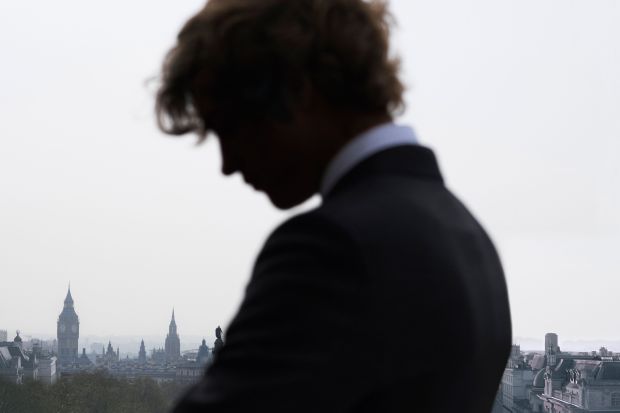
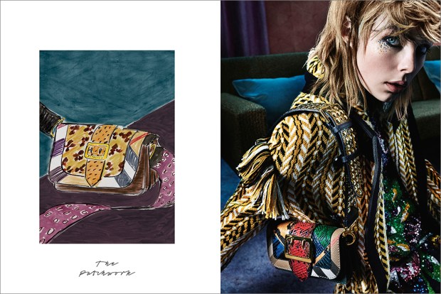
burberry-fw16Is Burberry making a conservative political statement with its latest campaign?
Fall collections (spring collections? What are we calling them now? In any case: clothes shown in September) are always a bit more academic than their spring counterparts. Labels love to embrace the the back-to-school conceit: warm layers, crisp fall days of paging through course descriptions, and cozy autumn nights spent pouring over books in a university library in front of a roaring fire with the brilliant but troubled heir to England’s most storied dukedom.

Oh, just me?

Anyway, this year’s back-to-school fashion has pulled at interesting art-historical and art-philosophical threads, spawning interesting conversations about fashion as art, art in advertising, and artistic quotations — or appropriations — in apparel. This will be the first post in a three-part series unpacking these conversations, and what they mean for luxury strategy in a time of great industry upheaval. Take notes!

Burberry & The Makers

burberry-fall-2016-ad-campaign-the-impression-02

No, not a tribute band to the criminally underrated Reverend and the Makers, but the overarching theme of Burberry’s Fall 2016 strategy.

Following the Romantic, ruff-tastic September runway show, the label put on a pop-up exhibition in London called Maker’s House, where visitors could explore activities corresponding to crafts involved in the process of creating a Burberry garment or accessory, such as embroidery, engraving, and metalworking; or chat with a Burberry archivist about the brand’s history of craftsmanship (archivists: CALL ME). Guests could also interact with other artistic activities either tangentially connected with or theoretically adjacent to fashion, including drama, bookbinding, portrait painting, screenprinting, and calligraphy. I separate the categories here, but they were all presented side-by-side in a holistic way, treating all of the arts categories as relevant to the fashion-making process, but with a heavy emphasis on “making,” particularly of a physical product with one’s hands.

The subsequent ad campaign, a huge step up from last season’s tween-ish, Snappchatty-misstep, similarly reflects the process of creating heritage fashion, featuring either a sketch of the accessory or outfit, or an image of a craftsman opposite the finished product.

Burberry’s Maker’s House, while feeling a little too earnest for my taste and too ready to deploy my least favorite word, artisan, is both a safe yet unadventurous strategy for a post-Brexit Burberry, and an interesting plot point on the fashion-as-art chart.

Maker’s House exhibition explicitly situates fashion, specifically its technical side, squarely within the fine arts spectrum, almost like a guild-ish, specialty trade very specific to Britain. This is a great way to sell products to a discerning audience that values craftsmanship, but of all the rich and romantic cultural and historical connotations of Britishness, craftsmanship is not an especially glamorous tack to take. In fact, it’s the kind of traditionalism embodied by the Leave vote.

Now, I wouldn’t be so indelicate as to implicate anyone in the fashion community as being anything but the most ardent Remainers, but strategically, Maker’s House, despite its celebrity visitors and fun PR opportunity, is a very conservative concept. With this exhibition, Burberry has aligned its luxury fashion production with humble tradesmen, celebrating tradition, individualism, and manus over machina as their definition of Britishness post-Brexit. I would have expected a more cosmopolitan response from Christopher Bailey, something like a YBA collaboration, a campaign starring Zadie Smith and Zayn instead of Edie Campbell, AGAIN, or a zeitgeist-y celebration of Cool Brittania, with the Moss, Gallagher, Beckham, and Law kids as a response to what Britishness means now, and not, as one reader has put it, a return to the Shire. I think Maker’s House should have been more of a celebration of fashion as a visual, experiential, and performative art, and slotted fashion alongside the more analogous (and glamorous) British traditions of music, painting, literature, and drama, rather than a manual craft. But then again, this might be a London or England-centric point of view. However, I think it’s essential for Burberry to keep its cool edge, and not fall into a Mulberry slump, or worse, become a leather-goods-only bore or a suburban joke. Coach, I’m looking at you. Don’t you. Even. Think. About. It.

The weak pound might actually give Burberry some room to play and embrace a more cosmopolitan narrative of Britishness in upcoming seasons. Although their shares are down and the luxury market is having a difficult year, Burberry has been doing relatively well in the home market, thanks to tourists flocking in to shop. Not well enough to counteract the overall luxury slump, since 85% of their sales are made outside of Britain, but much better than expected.

A double down on their uniquely British identity post-Brexit was exactly the right tactic for Burberry to take in this first season after the political shake-up, but they chose the wrong strand of British creative arts to celebrate and with which to associate the brand – the technical crafts rather than the visual arts. With all the romantic, rich cultural and historical cache from which to draw surrounding what it means to be British today, Burberry played it too safe in placing their craftsmanship heritage above a more interesting and consumer-friendly facets of the brand, like their long investigation of British rock & roll, celebrity ambassador opportunities, and, simply, really interesting, fashion-forward pieces that could make a killing if they hit Instagram Gucci-style.

I’m hoping Burberry changes direction for their always-great holiday campaign, where they can really have fun and hit heavy with star power. All I am saying is that it BETTER star Millie Bobby Brown, Tracy Emin, and Harry Styles or I’m going to have to up my dosage of antidepressants.


A Tale of Two Fragrances, or Burberry’s Continued Asininity and Jo Malone’s Quiet Success

B3-Sampling-image-main.jpeg
British brands Burberry and Jo Malone have each come out with a new fragrance campaign in the last week —Burberry’s for a new product, Mr. Burberry fragrance for men; and Jo Malone’s for a new concept: combining two existing scents into a personalized fragrance. Burberry should have aced the campaign, a short film directed by Academy Award winner and overall cool-coded Steve McQueen, but came up short; while Jo Malone, a label that rarely advertises, perfectly executed a simple visual campaign that capitalizes on the trend of personalization —ironically, a trend on which Burberry was on the forefront about two years ago, with their monogrammed ponchos and My Burberry fragrances.
 

 Mr. Burberry is Burberry’s first fragrance aimed exclusively at men — their other fragrances, like London, Brit, and The Beat all have a men’s and women’s component. This is a a smart move considering the growing interest and media coverage of men’s fashion, especially among younger audiences. It’s interesting when a brand choose a prefix as a fragrance name since it indicates that wearers of this fragrance, more than any of the other fragrances by the label, epitomizes the brand values. Remember the Sofia Coppola-directed videos for Miss Dior? Now those were the days.

This new video ad expands on the new, grittier direction Burberry is trying to take in order to woo the snapchatting, Silmane-devoted crowd. This marketing strategy is ludicrous, as I’ve explained in an earlier post, but Christopher Bailey is sticking to his guns. Steve McQueen directs the video, which is a brilliant choice, because he’s both an ultra-cool and critically acclaimed Londoner; someone like Tom Hooper would have been iffy. As a result, the video, which depicts a couple in a Piccadilly Square hotel room (quelle touristy!), looks like Shame without the pleasant physical appearance of Michael Fassbender — long shots that go on to the point of awkwardness, and a slightly unappealing, realistic portrayal of everyday events. It’s supposed to be glamorous, and some people will find it so — online publications have hailed it as “steamy” — but it’s not Burberry’s signature strain of sophisticated and subtle British glamour.

And then there’s the sex. Burberry has historically been superb at implying intimacy and  eroticism without actually portraying it — think of the smolderingly mysterious Hugh Dancy and Kate Moss ad for Burberry London, the 2005 Kate Moss ads with handsome strangers in the background, and the playful chemistry between Cara Delevigne and Eddie Redmayne in the 2012 campaign. The Mr. Burberry video situates sex front and center, and portrays it without a hint of mystery. It’s rendered awkward and unappealing because of McQueen’s directing style and the film’s overall gritty-lite aesthetic (NB: the male model has a chest tattoo and a pinky ring). It’s an off-brand misstep that unfortunately defines the video, and if Bailey’s not careful, will start to define the brand identity. Maybe they should change the name from Mr. Burberry to Mr. Grimy Quasi Burberry Offshoot Sister Line for Youths who Like Jayden Smith.

What Bailey should have done is take advantage of a great impending pop-cultural moment and on-brand stars and hired Kenneth Branagh to direct Richard Madden and Lily James in a short film for the fragrance. Freakishly attractive Madden and James will star together this summer in Branagh’s Romeo and Juliet in London. What could be more British, cool, and weighty-yet-accessible than this duo, Branagh, and Shakespeare?

Kbjh8EDWy_O8.jpg


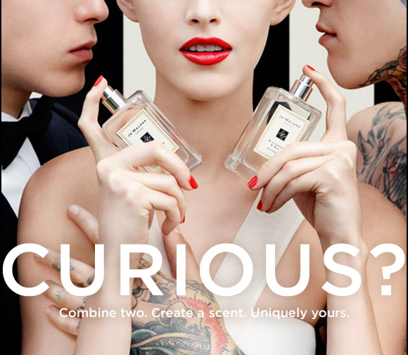
Jo Malone, on the other hand, implements the classic tropes of the bad boy and the ménage-à-trois to explain their new fragrance personalization concept. Titled “Curious?,” the ads feature a perfectly polished Jo Malone girl flanked by her usual type, a handsome, tux-clad man on one side, and a shirtless, heavily-tattooed guy on the other. Cheeky, flirty, and visually engaging — I like that we don’t see the models’ eyes— the ad encourages customers to embrace both the classic and the edgy parts of their tastes to create a scent unique and meaningful to them. This ad is still on-brand for Jo Malone, but gives the label a younger feel, while still maintaining their sense of feminine, English reserve, Sex here is intimated, which actually gives the ad more narrative latitude — the viewer has to do the guesswork, which forces them to be more visually and intellectually engaged in the ad, especially compared to Mr. Burberry’s awkward voyeurism.

The lessons here? Sex sells, but it sells better when it isn’t completely laid out to the viewers; both Burberry and Jo Malone are trying to reach new audiences, but while Burberry is veering dangerously off-track with their new aesthetic implementations, Jo Malone is fleshing theirs out with bolder advertisements. A label must strike a happy medium between what its core identity and what will appeal to a targeted audience when trying something new —like Jo Malone does here —while guarding against pandering to that audience.

The other lesson is to hire Kenneth Branagh for anything and everything, but you already knew that.