Photography

Report Card: F/W ’17 Ad Campaigns

1201454.jpgRaf Simons’s first Calvin Klein ad is a perfect mission statement for a new era.

This season’s spate of advertisements is, largely, absolutely fantastic. So fantastic, in fact, I went back and forth about including an exclamation point in this paragraph, but decided not to deploy one for reasons of self respect. The quality label-ambassador pairings we see this season perhaps reflect a deep thoughtfulness about brand identity in a time of industry upheaval—communicating a brand’s meaning is more important than ever when designers are playing musical chairs and consumers are saturated with digital media. Here are some of the high achievers.

Jude Law for Prada

prada-ss17-campaign_2-2-1024x593

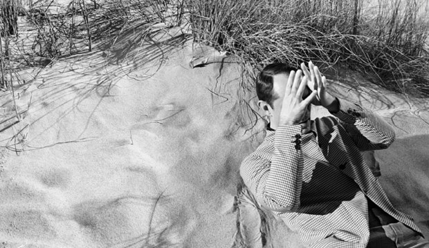
I love this. I love this so much that I would wallpaper my apartment with it, regardless of my deeply held opinion that Jude Law is the platonic ideal of human beauty. This minimal shoot by Willy Vanderperre nails the essence of Prada: practical, intellectual, and offbeat. Law lounges contemplatively amongst sand dunes in an array of unfussy and tailored shirts, pants, and even sandals (my rule about men in sandals—that it should never, ever occur unless one is an Olympic swimmer or any other type of water sports professional— is null and void when it comes to Prada, they of ugly-chic splendor). Law, despite actually being the most handsome man in the world, is the perfect choice for Prada, as both actor and brand are at interesting stages of their lives.

Law, now in his mid-40s, is taking a variety of unusual and supporting roles, rather than the typical leading man parts, including in Anna Karenena, The Grand Budapest Hotel, and Genius. At his Times Talk last June, he spoke to this shift as being both more natural than calculated and that collaborating with interesting directors is his main criterion when considering roles. So too, is Prada at a moment of transition. No longer the ‘it’ brand of the moment, Prada is reconnoitering the rapidly-evolving fashion landscape quietly, and perhaps in a reactionary way. Miuccia is carefully observing and pointedly not participating in the conversation around the turbulence of the designer revolving door, see-now-buy-now, and co-ed clothes, which, in a way, is reflective as the label’s status as a true luxury brand — not having to cater or pander to anyone or any trend in particular. She continues to produce quiet, sophisticated, and interesting clothing, almost as if to please herself. She will make large changes to brand strategy when she’s good and ready, but not before a great deal of consideration.

This collaboration is sublime; an alignment of artistic renaissances. and making old favorites current ones.

Grade: A

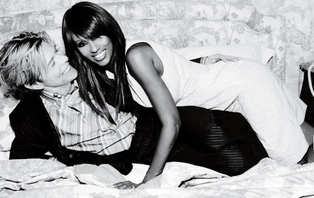
Charlotte Rampling for Loewe

This is a magnificent pairing — the most unusual and enigmatic actress of the twentieth century posing for Loewe, a recently-revived Spanish luxury label helmed by wunderkind Northern Irish Jonathan Anderson, known for his interesting silhouettes, proportion play, and gender-bending designs. Anderson is himself somewhat inscrutable, and his designs mercurial — some more intellectual, others more commercial — and entirely avoidant of the celebrity PR circuit — one rarely seen his clothes on a red carpet, and when one does, they’re on fellow sublime weirdo Tilda Swinton. Rampling, exceedingly private and dismissive of Hollywood, is the perfect face for the brand; a real meeting of the minds between designer and muse. I only wish this Jamie Hawkesworth-shot series was more visually engaging, and more suggestive of a narrative — a more fleshed-out setting would do the trick. The dark palette, too, makes it easy to visually skip over if one doesn’t have Rampling radar. Perfect casting, unremarkable execution.

Grade: B+

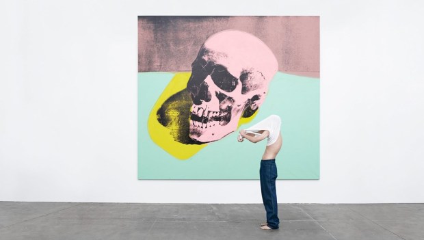
Art for Calvin Klein

1201453.jpg

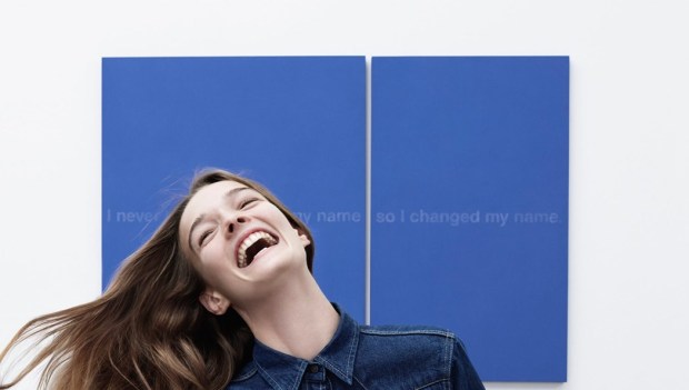
Raf Simons loves contemporary art. As demonstrated in the excellent yet ungrammatically titled documentary Dior and I, he frequently visits museums and galleries in search of inspiration, and has both collaborated with and referenced the artist Sterling Ruby while at Dior, and in his eponymous menswear line. I was curious to see what the first Calvin Klein ads would look like under Raf — he’s not one for cozying up to celebrities in his personal life or casting them in ads unless contractually obligated, yet Calvin Klein is, historically, a celebrity-driven brand, particularly in its advertising.

Instead of famous people, Simons cannily casts art by Andy Warhol, Richard Prince, and his bff Sterling Ruby in starring roles in the Willy Vandeperre-shot campaign, letting the paintings and their artists take center stage. Still, he plays with Calvin Klein tropes of denim, underwear, and young couples, giving them subtle, modern updates; the result is a little cleaner and a little more European. With the fun and accessible choices of art and the classic branding motifs, Raf acknowledges the label’s pop-cultural roots, but reframes them in a restrained way that is much more ‘him.’ This is a great first ad campaign under the new rule. I am so excited to see what’s to come, and how art will factor in in both the clothing and the advertising. Basically I hope this becomes an empire of Jil Sander.

Grade: A+


State of the Art: When Stella Met Ruscha

Ed_Ruscha_for_Stella_McCartney_Stellacares_fashion_editorial_Harley_Weir_Winter_2016.jpg
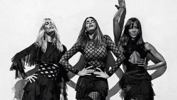
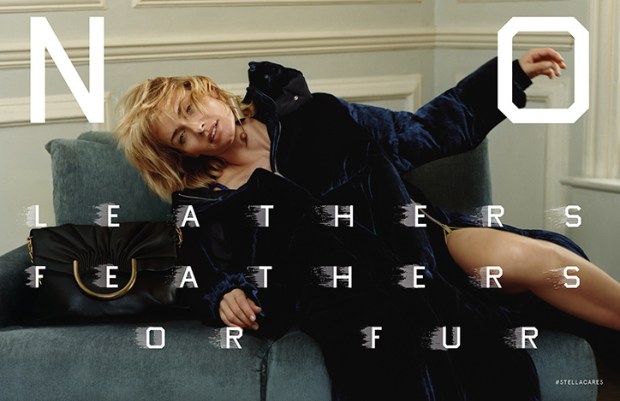
Stella McCartney’s F/W 2016 Campaign

This season, Stella McCartney teamed up with legendary artist Ed Ruscha on her Fall 2016 ad campaign. Shot by Harley Weir and starring Amber Valetta, the ads showcase the label’s core tenant of cruelty-free fashion, with Ruscha’s unmistakable typeface spelling out “No Leather, Feathers, or Fur,” “Veg Out,” and “Meat Free” across the images. This brilliant collaboration sets McCartney apart from her luxury rivals and lower-tier imitators as the undisputed queen of “vegetarian” fashion, and gives her heavyweight artistic credibility, when her famous friends and celebrity clients can sometimes overshadow her importance as a designer and fashion innovator. The campaign is also an unprecedented project between designer and artist that spawns a new chapter in the fashion-as-art debate: can fashion advertisements be art?

The collaboration was born when Ed Ruscha and Stella McCartney appeared together on an episode of Sundance’s Iconoclasts. The two are very different at first glance: Ruscha is a 79-year old Oklahoma-born American Artist whose text-centric art routinely passes through the doors of major auction houses, and is synonymous with a wry west coast cool; while McCartney is a British fashion designer forging a Kering-backed empire of sustainable fashion, and spawn and pal of celebrity. But the two come together seamlessly on the desire to communicate a large, important idea in a pithy and accessible way. Stella has the message, and Ruscha has the medium.

Fashion label-contemporary artist collaborations are nothing new, and the list of ventures is long and varied. Typically, however, we see artist collaborate on the design of a piece of apparel or accessory –  like Takashi Murakami, Richard Prince, and Stephen Sprouse for Louis Vuitton; Sterling Ruby for Raf Simons and Dior; and, most recently, Alex Katz for H&M. This territory is not new for Stella McCartney, who collaborated with Jeff Koons on rabbit pendants in the mid-2000s, which are now going for a pretty penny at auction.

The McCartney-Ruscha partnership, however, as an ad campaign, is a different animal. The closest thing to this kind of collaboration was when David Lynch photographed a campaign for Christian Louboutin in 2008. No other major artist has engaged in the advertising process so explicitly, and so adjacently to his own canon: the McCartney collaboration is an interesting extension of Ruscha’s work as a pop artist, and as an artist concerned with consumer culture, Hollywood, and, in fact, advertising itself.

McCartney’s label was one of the first ‘environmentally friendly’ labels when it was founded in 2001, eschewing the use of leather, fur, and feathers, and promoting organically grown fibers and sustainable fashion. Today, that message tends to be overlooked, and Stella McCartney is seen only as a British luxury label favored by celebrities and Team GB. With sustainability becoming a much-discussed topic and high priority within the fashion community, now is the perfect time for McCartney to remind the fashion world and its consumers of her pioneering status in the field and capitalize on the industry’s priority shift. The best way to remind conscious buyers of the brand’s tenants is visually, which is where the collaboration with Ruscha comes in. Ruscha’s paintings typically feature a word or phrase in a signature blocky font. His deadpan works frequently play on the tension between the opaque and the obvious, and modern life and nature, as many of the words are set against a landscape.

In the McCartney ads, however, the message is nothing but clear and not in the least ironic – Ruscha spells out the line’s ethos and reminds viewers of the label’s status as the only “vegetarian” luxury brand. This explicit visual reminder does wonders for repositioning McCartney as a model for companies seeking to create ethical fashion, and as the crown jewel in the Kering stable in terms of sustainability, which is one of the conglomerate’s biggest corporate goals. It also lends the label gravity and serious artistic credibility, and situates it as unique among labels as a pioneer in the advertisements-as-art field. This is also an interesting opportunity for Ruscha, allowing him to play in the advertising medium for a worthy but ultimately commercial cause, instead of lending tongue-in-cheek critique of consumerism from ultra-expensive paintings.

I’m of the opinion that fashion advertisements are art. They’re a perfect distillation of a brand’s meaning in a few photographs, and thus often more narratively full and than an editorial photograph. The McCartney-Ruscha partnership is the first of its kind, and I imagine an important milestone in positioning advertisements in a more artistic, and less commercial, light. I hope to see more to come – how about Tracy Emin for Gucci?


Celebrity Image Rehab with Alessandro Michele

tom2.jpg

Tom Hiddleston is covering major ground on the road to an image makeover after a humiliating summer.

Well, well, well, look who it is showing his sheepish and handsome face in the fall Gucci ads.

None other than Mr. Thomas William Hiddleston, actor, Shakespearean, and international punchline on a level of schadenfreude never before witnessed by human eyes.

After a summer of being a gossip site punching bag, human Muppet, and court jester to Satan, and along with losing the Emmy for The Night Manager and any shred of hope of landing the role of 007, Tommy is in need of a serious image overhaul. And what better than posing for the hottest luxury label in the world to regain one’s shredded dignity?

Tommy is a good fit for Gucci because of the new aesthetic direction Alessandro Michele has taken with the brand in the last year and a half. Gucci now codes for quirky, oddball glamour, with its Wes Anderson color palettes, zany accessories, and an overall aesthetic of weirdo chic. Tom is both classically handsome and very normal whilst being a pale, weirdo icon because of his roles in Marvel films and cult-y flicks like Only Lovers Left Alive. It has been sneeringly (and accurately) speculated that Tom wanted to shed his comic-con fanbase and become more of a mainstream movie star, presumably using a high-profile “relationship” with a singer as a spingboard (said singer who is “as big of a danger to the world as ISIS,” as my mother has put it.) But fronting a quirky brand like Gucci, instead of something like an ultra-boring but alpha male suit brand, is a gesture of atonement to disgruntled Dragonflies – I’m still in here, says Tommy. Forgive my desperation and moment of true, fever-dream, out-of-my-mind, insanity. Remember how good I was in Deep Blue Sea?

Tom’s also good for Gucci because of the label’s quest to embody the spirit of bohemian, English eccentricity. Michele, having worked for Gucci in London when under Tom Ford, is my peer in Anglomania, and has implemented a number of initiatives to imbue the Italian label with a British sensibility over the past few seasons, including holding a show at Westminster Abbey, forging a long-term partnership with Chatsworth House, where the Cruise 2017 campaign was shot, and appointing scions of offbeat, British glamour to be brand ambassadors, including Alexa Chung, Florence Welch, and, in a stroke of genius so sublime it makes me want to cry, Vanessa Redgrave. Tom’s a good celebrity to add to this stable, because he’s so very English – he literally looks like he could be an English gentleman from any of the last ten centuries – and yet current, handsome, and a little bit quirky.

This partnership happens to occur precisely when said gentleman is in need of some good press. No other brand is on Gucci’s level in terms of Instagram-mania, excitement, critical acclaim, and just really really cool clothes – exactly the kind of associations Tom needs after his summer of PR thirst exploded in his face over and over again like trick birthday candle. I’m convinced that Gucci is the only label that could rehab Tommy’s image in the public eye just at this moment, and I grudgingly admit that I feel relieved that Michele extended his hand to Tom in a gesture that marks Tom as pathetic no more, but actually cooler, and certainly more fashion-forward, than he was before his bummer summer.

The ads are great, too – saturated confections of satin and velvet dandyism, complete with  Judith Light dogs and feelings of isolation and anxiety that’s all both beautiful and slightly repulsive to look at. I applaud the execution and I think Tom bring something patrician yet geeky to the mix that makes him pitch-perfect embodiment of the Gucci look today.

I think young Tom has a ways to go on his path to media redemption and restoration to the title of the Thinking Woman’s Internet Boyfriend, but I can’t think of a better way to start than by starring in an ad like this for a brand like Gucci. Alessandro Michele might also want to consider a second career in celebrity image rehab. Move over Dr. Drew.


A Tale of Two Fragrances, or Burberry’s Continued Asininity and Jo Malone’s Quiet Success

B3-Sampling-image-main.jpeg
British brands Burberry and Jo Malone have each come out with a new fragrance campaign in the last week —Burberry’s for a new product, Mr. Burberry fragrance for men; and Jo Malone’s for a new concept: combining two existing scents into a personalized fragrance. Burberry should have aced the campaign, a short film directed by Academy Award winner and overall cool-coded Steve McQueen, but came up short; while Jo Malone, a label that rarely advertises, perfectly executed a simple visual campaign that capitalizes on the trend of personalization —ironically, a trend on which Burberry was on the forefront about two years ago, with their monogrammed ponchos and My Burberry fragrances.
 

 Mr. Burberry is Burberry’s first fragrance aimed exclusively at men — their other fragrances, like London, Brit, and The Beat all have a men’s and women’s component. This is a a smart move considering the growing interest and media coverage of men’s fashion, especially among younger audiences. It’s interesting when a brand choose a prefix as a fragrance name since it indicates that wearers of this fragrance, more than any of the other fragrances by the label, epitomizes the brand values. Remember the Sofia Coppola-directed videos for Miss Dior? Now those were the days.

This new video ad expands on the new, grittier direction Burberry is trying to take in order to woo the snapchatting, Silmane-devoted crowd. This marketing strategy is ludicrous, as I’ve explained in an earlier post, but Christopher Bailey is sticking to his guns. Steve McQueen directs the video, which is a brilliant choice, because he’s both an ultra-cool and critically acclaimed Londoner; someone like Tom Hooper would have been iffy. As a result, the video, which depicts a couple in a Piccadilly Square hotel room (quelle touristy!), looks like Shame without the pleasant physical appearance of Michael Fassbender — long shots that go on to the point of awkwardness, and a slightly unappealing, realistic portrayal of everyday events. It’s supposed to be glamorous, and some people will find it so — online publications have hailed it as “steamy” — but it’s not Burberry’s signature strain of sophisticated and subtle British glamour.

And then there’s the sex. Burberry has historically been superb at implying intimacy and  eroticism without actually portraying it — think of the smolderingly mysterious Hugh Dancy and Kate Moss ad for Burberry London, the 2005 Kate Moss ads with handsome strangers in the background, and the playful chemistry between Cara Delevigne and Eddie Redmayne in the 2012 campaign. The Mr. Burberry video situates sex front and center, and portrays it without a hint of mystery. It’s rendered awkward and unappealing because of McQueen’s directing style and the film’s overall gritty-lite aesthetic (NB: the male model has a chest tattoo and a pinky ring). It’s an off-brand misstep that unfortunately defines the video, and if Bailey’s not careful, will start to define the brand identity. Maybe they should change the name from Mr. Burberry to Mr. Grimy Quasi Burberry Offshoot Sister Line for Youths who Like Jayden Smith.

What Bailey should have done is take advantage of a great impending pop-cultural moment and on-brand stars and hired Kenneth Branagh to direct Richard Madden and Lily James in a short film for the fragrance. Freakishly attractive Madden and James will star together this summer in Branagh’s Romeo and Juliet in London. What could be more British, cool, and weighty-yet-accessible than this duo, Branagh, and Shakespeare?

Kbjh8EDWy_O8.jpg


Jo Malone, on the other hand, implements the classic tropes of the bad boy and the ménage-à-trois to explain their new fragrance personalization concept. Titled “Curious?,” the ads feature a perfectly polished Jo Malone girl flanked by her usual type, a handsome, tux-clad man on one side, and a shirtless, heavily-tattooed guy on the other. Cheeky, flirty, and visually engaging — I like that we don’t see the models’ eyes— the ad encourages customers to embrace both the classic and the edgy parts of their tastes to create a scent unique and meaningful to them. This ad is still on-brand for Jo Malone, but gives the label a younger feel, while still maintaining their sense of feminine, English reserve, Sex here is intimated, which actually gives the ad more narrative latitude — the viewer has to do the guesswork, which forces them to be more visually and intellectually engaged in the ad, especially compared to Mr. Burberry’s awkward voyeurism.

The lessons here? Sex sells, but it sells better when it isn’t completely laid out to the viewers; both Burberry and Jo Malone are trying to reach new audiences, but while Burberry is veering dangerously off-track with their new aesthetic implementations, Jo Malone is fleshing theirs out with bolder advertisements. A label must strike a happy medium between what its core identity and what will appeal to a targeted audience when trying something new —like Jo Malone does here —while guarding against pandering to that audience.

The other lesson is to hire Kenneth Branagh for anything and everything, but you already knew that.

Spin Class: Dior and J-Law in the Post-Raf Era

jennifer-lawrence-dior-600x387.jpg

I never thought this day would come. The day when I say that Jennifer Lawrence not only looks great in Dior’s new Mario Sorrenti-shot ads, but also actually looks like a fitting representative of the world’s premiere luxury fashion brand. Has hell frozen over? Apparently not — Dior’s marketing team has just finally realized they should play to JLaw’s (relative — let’s not get gushy) strengths, instead of putting her into an archetypal mold that doesn’t fit. Let’s first recap the long and tragic history that is Dior: the JLaw Years.

Jennifer Lawrence became the face of Dior in 2012, when Raf Simons took over the label. This was a terrible choice for both parties. It was a bad move for Dior because Lawrence is unsophisticated and too relatable, with her “down to earth” lifestyle choices and penchant for crude humor and childish antics — this is the woman who engages in walrus pantomimes with chopsticks and wears jackets with “perv” emblazoned on the back. Dior, as one of the most elegant and storied fashion labels, needs a spokeswoman who embodies their sophisticated values — I loved what they did last spring with Rihanna, who, while not Grace Kelly, still fits the bill because of her impeccable fashion instincts and comfortability in her own skin, and adds an appealing edge to a label that can quickly get too feminine. The Dior partnership was a terrible choice for Lawrence (aside from the 7-figure payday) because it’s locked her in to Dior for all red carpet appearances until 2017, which doesn’t suit her in the least — she hasn’t looked good since the 2011 Oscars where she wore the blood orange Calvin Klein.The contract has robbed her of the chance to form any kind of sartorial identity and confuses her cultural coding — she’s photographed cracking open beers with bottled water caps and wearing double denim one minute, and looking awful in a frilly cupcake mess on the red carpet the next. It’s a complete mismatch for both parties.

Unless you can spin it, which is what Dior has done for this season’s ad campaign, to great effect. These ads are about laid-back glamour, which is much more Lawrence’s speed. She looks chic and refined, (in a borderline Olsen way — I can’t believe I’m saying this) and finally looks comfortable as the face of the brand, bringing a warmth to the photos. This campaign capitalizes on her approachability while still situating her as aspirational, (the placement behind the bags and couch visually helps with this) instead of trying to cast her as a Hitchcockian ice queen like Raf did during his tenure, a role that didn’t fit her and made her look wan and deeply uncomfortable.  But in these new ads, Dior and Lawrence have hit a sweet spot where both of their brand codings are in synch — easygoing-ness meets Parisian chic — which makes this campaign not only work, but succeed exceptionally well.

A mismatch, especially a contractual and expensive one like this, doesn’t have to be the end of the world if both the brand and the representative can be strategic and thoughtful about where their Venn diagrams overlap. I hope Dior can keep this momentum until they can get a more natural fit for their brand, (2018, please come quickly). But in the meantime, dare I say…I look forward to see how they meet this challenge? I never thought I would be capable of uttering those words, and yet here we are. That’s the power of good marketing, I suppose.

Report Card: S/S ’16 Ad Campaigns

The new ads are in, and the results are not great my friends. Brands and spokespeople were mismatched, art direction was lackluster, and ads had a somber quality to them, perhaps stemming from the recent upheaval in the industry and the hit that the luxury markets have taken in China. Let’s discuss.

Ruby Rose for Ralph Lauren Denim Supply

640_ruby_rose_hailey_baldwin_ralphlauren_010615.jpg

Oh. Oh dear. This keeps eliciting laughs from me. I know Ralph Lauren is under new management and in desperate need to project a younger, cooler image (may I remind you that Ralph Lauren is a major sponsor of Masterpiece Theatre). It’s like they watched The Grapes of Wrath  on a TV with poorly-operating antennae, put on a blindfold, and threw a dart at a young celebrity that codes for cool and edgy. This is a tragic mismatch, and the result is schadenfreudeish. The corresponding video is even worse, bringing this depression-era Madewell shopping spree to life — the only redeeming quality of the digital component is the presence of a hedgehog.

Who would be a better face of Ralph Lauren (providing there’s better art direction)? It’s tough to say, seeing how this big brand has become amorphous and bloated by offshoot lines in the past ten years. I would go for an all-American face, like none other than Lauren Bush Lauren. She’s close to the brand, yes, but she’s an accomplished social entrepreneur with ties to two American dynasties — and Ralph Lauren is all about living the American dream. And if Tom Ford can star in his own campaigns, LBL can advertise for her in-laws.

Grade: D


Claudia Schiffer, Cindy Crawford, and Naomi Campbell for Balmain

dynamic_resize.jpeg

This is great. It’s all the glamour and drama associated with Balmain, but without the off-putting high-maintenance flashiness. The black and white is subdued, and a nice departure from the garish colors that we’ve seen from Balmain recently, but there’s so much movement that it’s still electric — Cindy’s face and body is exquisite here.

Choosing the original Supers to font this campaign was a great move, because it capitalizes on 90’s nostalgia, and restores some sophistication to the brand after last season’s Jenner sisters ad. It’s also nice in conversation with the Balmain x H&M campaign, which featured the “Supers” of today, Gigi, Kendall, and Jourdan, whose looks mirror those of Claudia, Cindy, and Naomi.

Grade: A-


Assorted Teens for Burberry 

burberry-1.jpg

Burberry is catering to a younger crowd with this campaign, with its choice of up-and-coming young models like Ruth and May Bell and Dylan Brosnan, its debut of Snapchat (why?), and the grittier aesthetic portrayed here with a Juergen-y high-exposure flash. This makes sense, given that Burberry’s sales were down the last quarter, and Christopher Bailey has been under pressure to prove himself as CEO. Digital innovation under his guidance got the brand to where it is today, so it’s natural that he would double down on this strategy when he’s feeling the heat.

I’m not sure this is the right tack, however. It’s incredibly alienating to more sophisticated buyers and cheapens the brand’s heritage history by making it seem young and ephemeral. Although it’s important to stay relevant to a younger demographic, teenagers aren’t the group with the purchasing power Burberry needs. They need to keep their messaging consistent with what they did in their holiday campaign, and sell aspirational, inclusive, glamorous, British sophistication, which is what they do best.

Grade: C-


Zoë Kravitz and Anna Ewers for Balenciaga

balenciaga-zoe-kravitz.0.jpg

Finally! Someone took my advice and put Zoë Kravitz, intriguing chameleon of cool pedigree, in an ad campaign. I love the sleepy, romantic panned out shot of the two women, but the close-up shots are empty, uninteresting, and tell me nothing about the brand.

This is not a great way for Alexander Wang to end his short legacy at Balenciaga — this looks hastily done and doesn’t come across as a thoughtful farewell. If he were going to cop out, he ought to have shot Kravitz holding the Le Dix bag and called it a day. (Does anyone know if the label will continue to make these post-Wang? If not, I’ll need to acquire a loan immediately.)

Grade: C-


Starman, the Ad-man

davidguitar2

Tommy Hilfiger, 2004

Fashion publications have made much of David Bowie’s contribution to fashion and his inimitable personal style in the days since his death, and rightly so. But I’d like to talk about his unique role in fashion advertising.

Throughout the course of his decades-long career, he appeared in a handful of ads for companies ranging from Pepsi to Louis Vuitton, unlike any of his iconic contemporaries in music, who never fronted major consumer campaigns (the one exception being Keith Richards’ 2008 Louis Vuitton campaign). Why was Bowie coveted for campaigns more than any of the other rock stars?

It’s because of the duality of what he codes for in the culture. He’s simultaneously perceived as a cool, weirdo genius, and then as a complete cypher, making it easy for advertising to project whatever they want onto him while benefiting from his cool cultural cache. Additionally he, more than any other rock stars or any other cultural icons, exudes an almost otherworldly self-possession and comfort in his own skin, which is what every consumer company is trying to sell. He’s so untouchable, so icy, so alien, so intellectually weighty, and, despite his rolodex of zany characters, he always plays himself in ads, which makes them some of the most effective campaigns I’ve ever seen. Exhibit A:

Louis Vuitton, “L’Invitation Au Voyage,” 2013

In this short film and corresponding print campaign, Arizona Muse arrives (via hot air balloon) to a mysterious Venetian masquerade party straight out of Sofia Coppola’s Marie Antoinette. Bowie plays “I’d Rather Be High” on the harpsichord as revelers revel and Muse orients herself among the partygoers, uncertainly at first, then, after sitting on the bench with Bowie, excitedly. She opens her eyes to realize it was a dream — but then finds a note on the harpsichord, apparently an invitation. The film ends with Muse sailing solo through a Venetian canal into the sunrise. The world the film creates is sumptuous without being decadent, and Bowie is mysterious, sophisticated, and intriguing: everything the brand hopes to convey.

The print ad could be a subdued moment from the film, where Bowie is no longer at the center of the action, but in a corner, facing three masked women, which we see in a mirror behind him in a Folies-Berger trick. Both parties seem to be attracted and repulsed by one another, creating an interesting tension with the dangerous but ultimately romantic and innocuous narrative presented in the film.

Bowie is perfect in these ads, and Louis Vuitton expertly plays on his coding duality, employing the rock star coding more heavily in the film, and the cypher coding more heavily in the print ad. In the film, he is extremely commanding as the center of the party and the apparent ringleader of partygoers, while being electrically compelling in his silent communication with Muse. The print ad is mysterious and muted, and conveys his alienation from us, and ours from him, which is echoed by the sharp key in which the music in the film is played. It’s an extremely intriguing set of media that play well off of each other in creating a narrative, and in smartly framing Bowie’s intensely attractive yet frightening physicality and mood.


Exhibit B: Tommy Hilfiger, 2004

daveiman4.jpg

In this black-and-white print campaign, Bowie and wife Iman are photographed glamorously doing everyday things, both at home and out and about. These are beautifully shot, but what’s striking is how much genuine fun they seem to be having — I don’t think I’ve seen such easy chemistry and palpable joy in any other photoshoot, advertising or editorial, ever. This campaign relies on pure rock-star coding, and includes shots with a guitar and a photo in the car that looks like a paparazzi snap, to great effect. It’s glamorous, sexy, fun, and kinetic, and impossible to take your eyes off of, and truly one of the best campaigns I’ve ever seen. This was Hilfiger at his peak — in touch with what is classic and cool, and thoughtful about the kinds of images and aspirations to which his audience responds. He needs to get back to a Bowie-Iman level with his brand, and present content like this with real cultural icons, and stop trying to shill Gigi Hadid in a rastafarian colored woven bikini top.

Starman is the ultimate ad-man, since he stands for both an iconic rock & roll star and a complete chameleonic enigma. Louis Vuitton and Tommy Hilfiger were so smart to spot this and play up one or both of these qualities in their advertising. I wish we could have had one more — Thierry Mugler’s Alien would have been too easy, and a Jurgen Teller Céline ad would have been wonderful. I’m also glad that Bowie didn’t take himself too seriously to not want to appear in ads — that speaks volumes about his cool, down-to-earth nature, even if he did fall to earth from somewhere else.