State of the Art

State of the Art: When Stella Met Ruscha

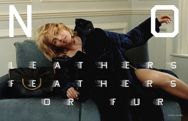
Ed_Ruscha_for_Stella_McCartney_Stellacares_fashion_editorial_Harley_Weir_Winter_2016.jpgStella McCartney’s F/W 2016 Campaign

This season, Stella McCartney teamed up with legendary artist Ed Ruscha on her Fall 2016 ad campaign. Shot by Harley Weir and starring Amber Valetta, the ads showcase the label’s core tenant of cruelty-free fashion, with Ruscha’s unmistakable typeface spelling out “No Leather, Feathers, or Fur,” “Veg Out,” and “Meat Free” across the images. This brilliant collaboration sets McCartney apart from her luxury rivals and lower-tier imitators as the undisputed queen of “vegetarian” fashion, and gives her heavyweight artistic credibility, when her famous friends and celebrity clients can sometimes overshadow her importance as a designer and fashion innovator. The campaign is also an unprecedented project between designer and artist that spawns a new chapter in the fashion-as-art debate: can fashion advertisements be art?

The collaboration was born when Ed Ruscha and Stella McCartney appeared together on an episode of Sundance’s Iconoclasts. The two are very different at first glance: Ruscha is a 79-year old Oklahoma-born American Artist whose text-centric art routinely passes through the doors of major auction houses, and is synonymous with a wry west coast cool; while McCartney is a British fashion designer forging a Kering-backed empire of sustainable fashion, and spawn and pal of celebrity. But the two come together seamlessly on the desire to communicate a large, important idea in a pithy and accessible way. Stella has the message, and Ruscha has the medium.

Fashion label-contemporary artist collaborations are nothing new, and the list of ventures is long and varied. Typically, however, we see artist collaborate on the design of a piece of apparel or accessory –  like Takashi Murakami, Richard Prince, and Stephen Sprouse for Louis Vuitton; Sterling Ruby for Raf Simons and Dior; and, most recently, Alex Katz for H&M. This territory is not new for Stella McCartney, who collaborated with Jeff Koons on rabbit pendants in the mid-2000s, which are now going for a pretty penny at auction.

The McCartney-Ruscha partnership, however, as an ad campaign, is a different animal. The closest thing to this kind of collaboration was when David Lynch photographed a campaign for Christian Louboutin in 2008. No other major artist has engaged in the advertising process so explicitly, and so adjacently to his own canon: the McCartney collaboration is an interesting extension of Ruscha’s work as a pop artist, and as an artist concerned with consumer culture, Hollywood, and, in fact, advertising itself.

McCartney’s label was one of the first ‘environmentally friendly’ labels when it was founded in 2001, eschewing the use of leather, fur, and feathers, and promoting organically grown fibers and sustainable fashion. Today, that message tends to be overlooked, and Stella McCartney is seen only as a British luxury label favored by celebrities and Team GB. With sustainability becoming a much-discussed topic and high priority within the fashion community, now is the perfect time for McCartney to remind the fashion world and its consumers of her pioneering status in the field and capitalize on the industry’s priority shift. The best way to remind conscious buyers of the brand’s tenants is visually, which is where the collaboration with Ruscha comes in. Ruscha’s paintings typically feature a word or phrase in a signature blocky font. His deadpan works frequently play on the tension between the opaque and the obvious, and modern life and nature, as many of the words are set against a landscape.

In the McCartney ads, however, the message is nothing but clear and not in the least ironic – Ruscha spells out the line’s ethos and reminds viewers of the label’s status as the only “vegetarian” luxury brand. This explicit visual reminder does wonders for repositioning McCartney as a model for companies seeking to create ethical fashion, and as the crown jewel in the Kering stable in terms of sustainability, which is one of the conglomerate’s biggest corporate goals. It also lends the label gravity and serious artistic credibility, and situates it as unique among labels as a pioneer in the advertisements-as-art field. This is also an interesting opportunity for Ruscha, allowing him to play in the advertising medium for a worthy but ultimately commercial cause, instead of lending tongue-in-cheek critique of consumerism from ultra-expensive paintings.

I’m of the opinion that fashion advertisements are art. They’re a perfect distillation of a brand’s meaning in a few photographs, and thus often more narratively full and than an editorial photograph. The McCartney-Ruscha partnership is the first of its kind, and I imagine an important milestone in positioning advertisements in a more artistic, and less commercial, light. I hope to see more to come – how about Tracy Emin for Gucci?


State of the Art: Burberry’s Post-Brexit Guild-ed Age

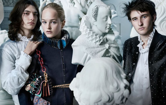
burberry-fw16Is Burberry making a conservative political statement with its latest campaign?
Fall collections (spring collections? What are we calling them now? In any case: clothes shown in September) are always a bit more academic than their spring counterparts. Labels love to embrace the the back-to-school conceit: warm layers, crisp fall days of paging through course descriptions, and cozy autumn nights spent pouring over books in a university library in front of a roaring fire with the brilliant but troubled heir to England’s most storied dukedom.

Oh, just me?

Anyway, this year’s back-to-school fashion has pulled at interesting art-historical and art-philosophical threads, spawning interesting conversations about fashion as art, art in advertising, and artistic quotations — or appropriations — in apparel. This will be the first post in a three-part series unpacking these conversations, and what they mean for luxury strategy in a time of great industry upheaval. Take notes!

Burberry & The Makers

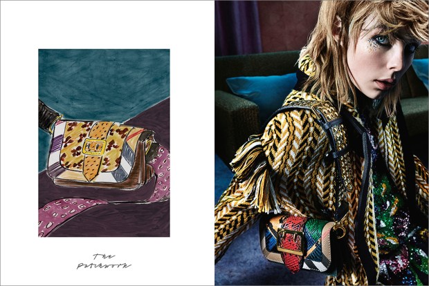
burberry-fall-2016-ad-campaign-the-impression-02

No, not a tribute band to the criminally underrated Reverend and the Makers, but the overarching theme of Burberry’s Fall 2016 strategy.

Following the Romantic, ruff-tastic September runway show, the label put on a pop-up exhibition in London called Maker’s House, where visitors could explore activities corresponding to crafts involved in the process of creating a Burberry garment or accessory, such as embroidery, engraving, and metalworking; or chat with a Burberry archivist about the brand’s history of craftsmanship (archivists: CALL ME). Guests could also interact with other artistic activities either tangentially connected with or theoretically adjacent to fashion, including drama, bookbinding, portrait painting, screenprinting, and calligraphy. I separate the categories here, but they were all presented side-by-side in a holistic way, treating all of the arts categories as relevant to the fashion-making process, but with a heavy emphasis on “making,” particularly of a physical product with one’s hands.

The subsequent ad campaign, a huge step up from last season’s tween-ish, Snappchatty-misstep, similarly reflects the process of creating heritage fashion, featuring either a sketch of the accessory or outfit, or an image of a craftsman opposite the finished product.

Burberry’s Maker’s House, while feeling a little too earnest for my taste and too ready to deploy my least favorite word, artisan, is both a safe yet unadventurous strategy for a post-Brexit Burberry, and an interesting plot point on the fashion-as-art chart.

Maker’s House exhibition explicitly situates fashion, specifically its technical side, squarely within the fine arts spectrum, almost like a guild-ish, specialty trade very specific to Britain. This is a great way to sell products to a discerning audience that values craftsmanship, but of all the rich and romantic cultural and historical connotations of Britishness, craftsmanship is not an especially glamorous tack to take. In fact, it’s the kind of traditionalism embodied by the Leave vote.

Now, I wouldn’t be so indelicate as to implicate anyone in the fashion community as being anything but the most ardent Remainers, but strategically, Maker’s House, despite its celebrity visitors and fun PR opportunity, is a very conservative concept. With this exhibition, Burberry has aligned its luxury fashion production with humble tradesmen, celebrating tradition, individualism, and manus over machina as their definition of Britishness post-Brexit. I would have expected a more cosmopolitan response from Christopher Bailey, something like a YBA collaboration, a campaign starring Zadie Smith and Zayn instead of Edie Campbell, AGAIN, or a zeitgeist-y celebration of Cool Brittania, with the Moss, Gallagher, Beckham, and Law kids as a response to what Britishness means now, and not, as one reader has put it, a return to the Shire. I think Maker’s House should have been more of a celebration of fashion as a visual, experiential, and performative art, and slotted fashion alongside the more analogous (and glamorous) British traditions of music, painting, literature, and drama, rather than a manual craft. But then again, this might be a London or England-centric point of view. However, I think it’s essential for Burberry to keep its cool edge, and not fall into a Mulberry slump, or worse, become a leather-goods-only bore or a suburban joke. Coach, I’m looking at you. Don’t you. Even. Think. About. It.

The weak pound might actually give Burberry some room to play and embrace a more cosmopolitan narrative of Britishness in upcoming seasons. Although their shares are down and the luxury market is having a difficult year, Burberry has been doing relatively well in the home market, thanks to tourists flocking in to shop. Not well enough to counteract the overall luxury slump, since 85% of their sales are made outside of Britain, but much better than expected.

A double down on their uniquely British identity post-Brexit was exactly the right tactic for Burberry to take in this first season after the political shake-up, but they chose the wrong strand of British creative arts to celebrate and with which to associate the brand – the technical crafts rather than the visual arts. With all the romantic, rich cultural and historical cache from which to draw surrounding what it means to be British today, Burberry played it too safe in placing their craftsmanship heritage above a more interesting and consumer-friendly facets of the brand, like their long investigation of British rock & roll, celebrity ambassador opportunities, and, simply, really interesting, fashion-forward pieces that could make a killing if they hit Instagram Gucci-style.

I’m hoping Burberry changes direction for their always-great holiday campaign, where they can really have fun and hit heavy with star power. All I am saying is that it BETTER star Millie Bobby Brown, Tracy Emin, and Harry Styles or I’m going to have to up my dosage of antidepressants.