Luxury

A Tale of Two Fragrances, or Burberry’s Continued Asininity and Jo Malone’s Quiet Success

B3-Sampling-image-main.jpeg
British brands Burberry and Jo Malone have each come out with a new fragrance campaign in the last week —Burberry’s for a new product, Mr. Burberry fragrance for men; and Jo Malone’s for a new concept: combining two existing scents into a personalized fragrance. Burberry should have aced the campaign, a short film directed by Academy Award winner and overall cool-coded Steve McQueen, but came up short; while Jo Malone, a label that rarely advertises, perfectly executed a simple visual campaign that capitalizes on the trend of personalization —ironically, a trend on which Burberry was on the forefront about two years ago, with their monogrammed ponchos and My Burberry fragrances.
 

 Mr. Burberry is Burberry’s first fragrance aimed exclusively at men — their other fragrances, like London, Brit, and The Beat all have a men’s and women’s component. This is a a smart move considering the growing interest and media coverage of men’s fashion, especially among younger audiences. It’s interesting when a brand choose a prefix as a fragrance name since it indicates that wearers of this fragrance, more than any of the other fragrances by the label, epitomizes the brand values. Remember the Sofia Coppola-directed videos for Miss Dior? Now those were the days.

This new video ad expands on the new, grittier direction Burberry is trying to take in order to woo the snapchatting, Silmane-devoted crowd. This marketing strategy is ludicrous, as I’ve explained in an earlier post, but Christopher Bailey is sticking to his guns. Steve McQueen directs the video, which is a brilliant choice, because he’s both an ultra-cool and critically acclaimed Londoner; someone like Tom Hooper would have been iffy. As a result, the video, which depicts a couple in a Piccadilly Square hotel room (quelle touristy!), looks like Shame without the pleasant physical appearance of Michael Fassbender — long shots that go on to the point of awkwardness, and a slightly unappealing, realistic portrayal of everyday events. It’s supposed to be glamorous, and some people will find it so — online publications have hailed it as “steamy” — but it’s not Burberry’s signature strain of sophisticated and subtle British glamour.

And then there’s the sex. Burberry has historically been superb at implying intimacy and  eroticism without actually portraying it — think of the smolderingly mysterious Hugh Dancy and Kate Moss ad for Burberry London, the 2005 Kate Moss ads with handsome strangers in the background, and the playful chemistry between Cara Delevigne and Eddie Redmayne in the 2012 campaign. The Mr. Burberry video situates sex front and center, and portrays it without a hint of mystery. It’s rendered awkward and unappealing because of McQueen’s directing style and the film’s overall gritty-lite aesthetic (NB: the male model has a chest tattoo and a pinky ring). It’s an off-brand misstep that unfortunately defines the video, and if Bailey’s not careful, will start to define the brand identity. Maybe they should change the name from Mr. Burberry to Mr. Grimy Quasi Burberry Offshoot Sister Line for Youths who Like Jayden Smith.

What Bailey should have done is take advantage of a great impending pop-cultural moment and on-brand stars and hired Kenneth Branagh to direct Richard Madden and Lily James in a short film for the fragrance. Freakishly attractive Madden and James will star together this summer in Branagh’s Romeo and Juliet in London. What could be more British, cool, and weighty-yet-accessible than this duo, Branagh, and Shakespeare?
Kbjh8EDWy_O8.jpg


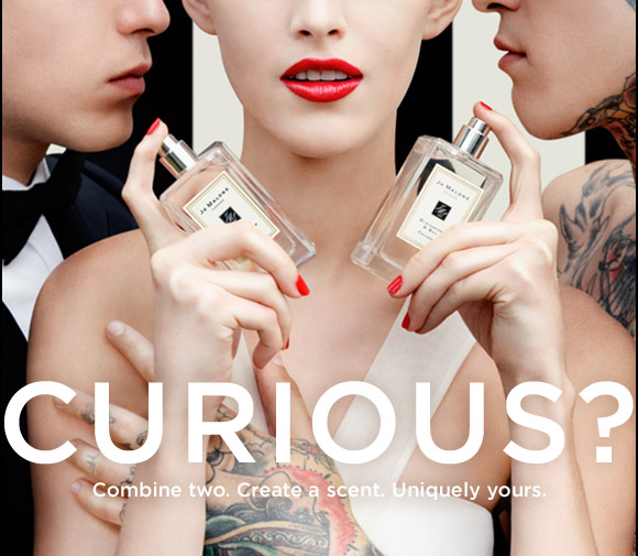
Jo Malone, on the other hand, implements the classic tropes of the bad boy and the ménage-à-trois to explain their new fragrance personalization concept. Titled “Curious?,” the ads feature a perfectly polished Jo Malone girl flanked by her usual type, a handsome, tux-clad man on one side, and a shirtless, heavily-tattooed guy on the other. Cheeky, flirty, and visually engaging — I like that we don’t see the models’ eyes— the ad encourages customers to embrace both the classic and the edgy parts of their tastes to create a scent unique and meaningful to them. This ad is still on-brand for Jo Malone, but gives the label a younger feel, while still maintaining their sense of feminine, English reserve, Sex here is intimated, which actually gives the ad more narrative latitude — the viewer has to do the guesswork, which forces them to be more visually and intellectually engaged in the ad, especially compared to Mr. Burberry’s awkward voyeurism.

The lessons here? Sex sells, but it sells better when it isn’t completely laid out to the viewers; both Burberry and Jo Malone are trying to reach new audiences, but while Burberry is veering dangerously off-track with their new aesthetic implementations, Jo Malone is fleshing theirs out with bolder advertisements. A label must strike a happy medium between what its core identity and what will appeal to a targeted audience when trying something new —like Jo Malone does here —while guarding against pandering to that audience.

The other lesson is to hire Kenneth Branagh for anything and everything, but you already knew that.

Spin Class: Dior and J-Law in the Post-Raf Era

jennifer-lawrence-dior-600x387.jpg

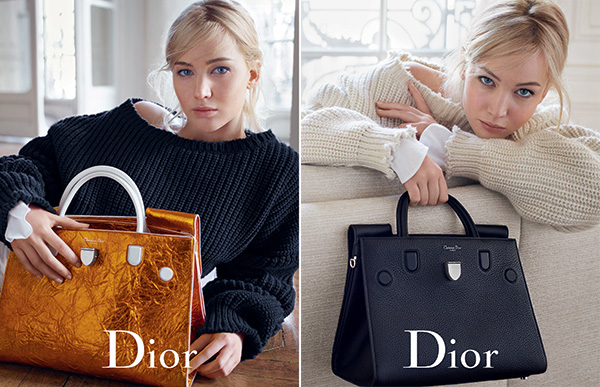
I never thought this day would come. The day when I say that Jennifer Lawrence not only looks great in Dior’s new Mario Sorrenti-shot ads, but also actually looks like a fitting representative of the world’s premiere luxury fashion brand. Has hell frozen over? Apparently not — Dior’s marketing team has just finally realized they should play to JLaw’s (relative — let’s not get gushy) strengths, instead of putting her into an archetypal mold that doesn’t fit. Let’s first recap the long and tragic history that is Dior: the JLaw Years.

Jennifer Lawrence became the face of Dior in 2012, when Raf Simons took over the label. This was a terrible choice for both parties. It was a bad move for Dior because Lawrence is unsophisticated and too relatable, with her “down to earth” lifestyle choices and penchant for crude humor and childish antics — this is the woman who engages in walrus pantomimes with chopsticks and wears jackets with “perv” emblazoned on the back. Dior, as one of the most elegant and storied fashion labels, needs a spokeswoman who embodies their sophisticated values — I loved what they did last spring with Rihanna, who, while not Grace Kelly, still fits the bill because of her impeccable fashion instincts and comfortability in her own skin, and adds an appealing edge to a label that can quickly get too feminine. The Dior partnership was a terrible choice for Lawrence (aside from the 7-figure payday) because it’s locked her in to Dior for all red carpet appearances until 2017, which doesn’t suit her in the least — she hasn’t looked good since the 2011 Oscars where she wore the blood orange Calvin Klein.The contract has robbed her of the chance to form any kind of sartorial identity and confuses her cultural coding — she’s photographed cracking open beers with bottled water caps and wearing double denim one minute, and looking awful in a frilly cupcake mess on the red carpet the next. It’s a complete mismatch for both parties.

Unless you can spin it, which is what Dior has done for this season’s ad campaign, to great effect. These ads are about laid-back glamour, which is much more Lawrence’s speed. She looks chic and refined, (in a borderline Olsen way — I can’t believe I’m saying this) and finally looks comfortable as the face of the brand, bringing a warmth to the photos. This campaign capitalizes on her approachability while still situating her as aspirational, (the placement behind the bags and couch visually helps with this) instead of trying to cast her as a Hitchcockian ice queen like Raf did during his tenure, a role that didn’t fit her and made her look wan and deeply uncomfortable.  But in these new ads, Dior and Lawrence have hit a sweet spot where both of their brand codings are in synch — easygoing-ness meets Parisian chic — which makes this campaign not only work, but succeed exceptionally well.

A mismatch, especially a contractual and expensive one like this, doesn’t have to be the end of the world if both the brand and the representative can be strategic and thoughtful about where their Venn diagrams overlap. I hope Dior can keep this momentum until they can get a more natural fit for their brand, (2018, please come quickly). But in the meantime, dare I say…I look forward to see how they meet this challenge? I never thought I would be capable of uttering those words, and yet here we are. That’s the power of good marketing, I suppose.

Report Card: S/S ’16 Ad Campaigns

The new ads are in, and the results are not great my friends. Brands and spokespeople were mismatched, art direction was lackluster, and ads had a somber quality to them, perhaps stemming from the recent upheaval in the industry and the hit that the luxury markets have taken in China. Let’s discuss.

Ruby Rose for Ralph Lauren Denim Supply

640_ruby_rose_hailey_baldwin_ralphlauren_010615.jpg

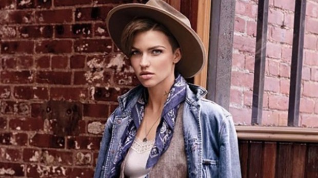
Oh. Oh dear. This keeps eliciting laughs from me. I know Ralph Lauren is under new management and in desperate need to project a younger, cooler image (may I remind you that Ralph Lauren is a major sponsor of Masterpiece Theatre). It’s like they watched The Grapes of Wrath  on a TV with poorly-operating antennae, put on a blindfold, and threw a dart at a young celebrity that codes for cool and edgy. This is a tragic mismatch, and the result is schadenfreudeish. The corresponding video is even worse, bringing this depression-era Madewell shopping spree to life — the only redeeming quality of the digital component is the presence of a hedgehog.

Who would be a better face of Ralph Lauren (providing there’s better art direction)? It’s tough to say, seeing how this big brand has become amorphous and bloated by offshoot lines in the past ten years. I would go for an all-American face, like none other than Lauren Bush Lauren. She’s close to the brand, yes, but she’s an accomplished social entrepreneur with ties to two American dynasties — and Ralph Lauren is all about living the American dream. And if Tom Ford can star in his own campaigns, LBL can advertise for her in-laws.

Grade: D


Claudia Schiffer, Cindy Crawford, and Naomi Campbell for Balmain

dynamic_resize.jpeg

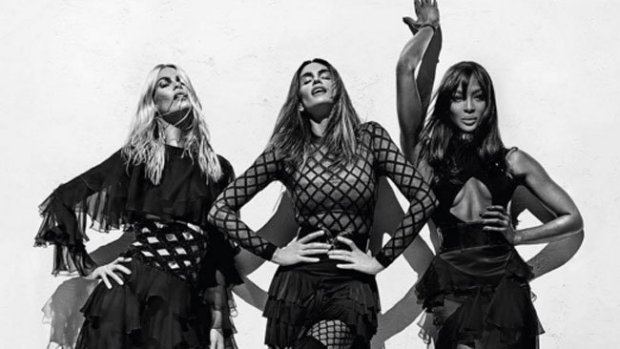
This is great. It’s all the glamour and drama associated with Balmain, but without the off-putting high-maintenance flashiness. The black and white is subdued, and a nice departure from the garish colors that we’ve seen from Balmain recently, but there’s so much movement that it’s still electric — Cindy’s face and body is exquisite here.

Choosing the original Supers to font this campaign was a great move, because it capitalizes on 90’s nostalgia, and restores some sophistication to the brand after last season’s Jenner sisters ad. It’s also nice in conversation with the Balmain x H&M campaign, which featured the “Supers” of today, Gigi, Kendall, and Jourdan, whose looks mirror those of Claudia, Cindy, and Naomi.

Grade: A-


Assorted Teens for Burberry 

burberry-1.jpg

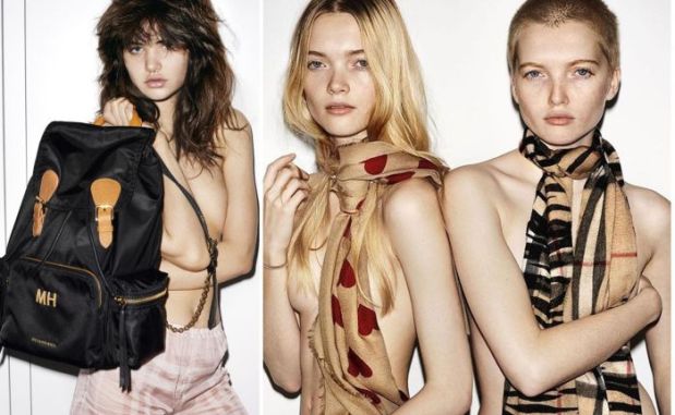
Burberry is catering to a younger crowd with this campaign, with its choice of up-and-coming young models like Ruth and May Bell and Dylan Brosnan, its debut of Snapchat (why?), and the grittier aesthetic portrayed here with a Juergen-y high-exposure flash. This makes sense, given that Burberry’s sales were down the last quarter, and Christopher Bailey has been under pressure to prove himself as CEO. Digital innovation under his guidance got the brand to where it is today, so it’s natural that he would double down on this strategy when he’s feeling the heat.

I’m not sure this is the right tack, however. It’s incredibly alienating to more sophisticated buyers and cheapens the brand’s heritage history by making it seem young and ephemeral. Although it’s important to stay relevant to a younger demographic, teenagers aren’t the group with the purchasing power Burberry needs. They need to keep their messaging consistent with what they did in their holiday campaign, and sell aspirational, inclusive, glamorous, British sophistication, which is what they do best.

Grade: C-


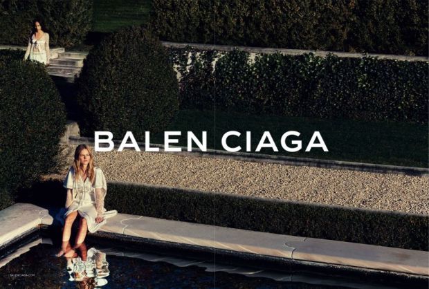
Zoë Kravitz and Anna Ewers for Balenciaga

balenciaga-zoe-kravitz.0.jpg

Finally! Someone took my advice and put Zoë Kravitz, intriguing chameleon of cool pedigree, in an ad campaign. I love the sleepy, romantic panned out shot of the two women, but the close-up shots are empty, uninteresting, and tell me nothing about the brand.

This is not a great way for Alexander Wang to end his short legacy at Balenciaga — this looks hastily done and doesn’t come across as a thoughtful farewell. If he were going to cop out, he ought to have shot Kravitz holding the Le Dix bag and called it a day. (Does anyone know if the label will continue to make these post-Wang? If not, I’ll need to acquire a loan immediately.)

Grade: C-


Starman, the Ad-man

davidguitar2

Tommy Hilfiger, 2004

Fashion publications have made much of David Bowie’s contribution to fashion and his inimitable personal style in the days since his death, and rightly so. But I’d like to talk about his unique role in fashion advertising.

Throughout the course of his decades-long career, he appeared in a handful of ads for companies ranging from Pepsi to Louis Vuitton, unlike any of his iconic contemporaries in music, who never fronted major consumer campaigns (the one exception being Keith Richards’ 2008 Louis Vuitton campaign). Why was Bowie coveted for campaigns more than any of the other rock stars?

It’s because of the duality of what he codes for in the culture. He’s simultaneously perceived as a cool, weirdo genius, and then as a complete cypher, making it easy for advertising to project whatever they want onto him while benefiting from his cool cultural cache. Additionally he, more than any other rock stars or any other cultural icons, exudes an almost otherworldly self-possession and comfort in his own skin, which is what every consumer company is trying to sell. He’s so untouchable, so icy, so alien, so intellectually weighty, and, despite his rolodex of zany characters, he always plays himself in ads, which makes them some of the most effective campaigns I’ve ever seen. Exhibit A:

Louis Vuitton, “L’Invitation Au Voyage,” 2013

In this short film and corresponding print campaign, Arizona Muse arrives (via hot air balloon) to a mysterious Venetian masquerade party straight out of Sofia Coppola’s Marie Antoinette. Bowie plays “I’d Rather Be High” on the harpsichord as revelers revel and Muse orients herself among the partygoers, uncertainly at first, then, after sitting on the bench with Bowie, excitedly. She opens her eyes to realize it was a dream — but then finds a note on the harpsichord, apparently an invitation. The film ends with Muse sailing solo through a Venetian canal into the sunrise. The world the film creates is sumptuous without being decadent, and Bowie is mysterious, sophisticated, and intriguing: everything the brand hopes to convey.

The print ad could be a subdued moment from the film, where Bowie is no longer at the center of the action, but in a corner, facing three masked women, which we see in a mirror behind him in a Folies-Berger trick. Both parties seem to be attracted and repulsed by one another, creating an interesting tension with the dangerous but ultimately romantic and innocuous narrative presented in the film.

Bowie is perfect in these ads, and Louis Vuitton expertly plays on his coding duality, employing the rock star coding more heavily in the film, and the cypher coding more heavily in the print ad. In the film, he is extremely commanding as the center of the party and the apparent ringleader of partygoers, while being electrically compelling in his silent communication with Muse. The print ad is mysterious and muted, and conveys his alienation from us, and ours from him, which is echoed by the sharp key in which the music in the film is played. It’s an extremely intriguing set of media that play well off of each other in creating a narrative, and in smartly framing Bowie’s intensely attractive yet frightening physicality and mood.


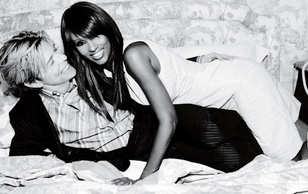
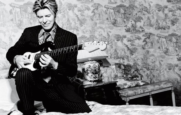
Exhibit B: Tommy Hilfiger, 2004

daveiman4.jpg

In this black-and-white print campaign, Bowie and wife Iman are photographed glamorously doing everyday things, both at home and out and about. These are beautifully shot, but what’s striking is how much genuine fun they seem to be having — I don’t think I’ve seen such easy chemistry and palpable joy in any other photoshoot, advertising or editorial, ever. This campaign relies on pure rock-star coding, and includes shots with a guitar and a photo in the car that looks like a paparazzi snap, to great effect. It’s glamorous, sexy, fun, and kinetic, and impossible to take your eyes off of, and truly one of the best campaigns I’ve ever seen. This was Hilfiger at his peak — in touch with what is classic and cool, and thoughtful about the kinds of images and aspirations to which his audience responds. He needs to get back to a Bowie-Iman level with his brand, and present content like this with real cultural icons, and stop trying to shill Gigi Hadid in a rastafarian colored woven bikini top.

Starman is the ultimate ad-man, since he stands for both an iconic rock & roll star and a complete chameleonic enigma. Louis Vuitton and Tommy Hilfiger were so smart to spot this and play up one or both of these qualities in their advertising. I wish we could have had one more — Thierry Mugler’s Alien would have been too easy, and a Jurgen Teller Céline ad would have been wonderful. I’m also glad that Bowie didn’t take himself too seriously to not want to appear in ads — that speaks volumes about his cool, down-to-earth nature, even if he did fall to earth from somewhere else.

D&G’s Modest Proposal


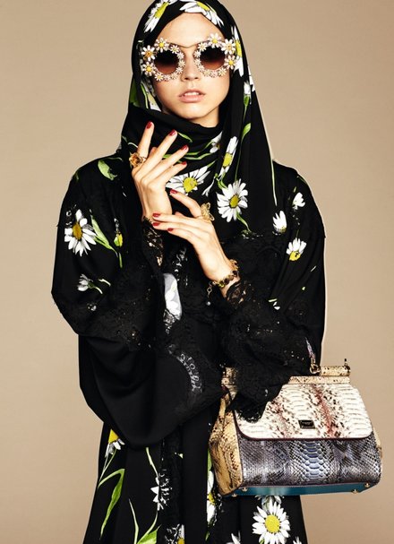
Following on the heels of an H&M ad campaign that featured a model clad in a hijab, today Dolce & Gabbana announced a collection of hijabs and abayas aimed at fashion-conscious Muslim customers.

This is absolutely brilliant business strategy every way you slice it.

While other designers like Donna Karan have done capsule collections aimed at Muslim women during Ramadan, Dolce & Gabbana’s line looks to be a permanent addition to their label, making them the first luxury line to cater to this large demographic — a Reuters report claims that Muslim shoppers spent $266 billion on apparel and footwear in 2013, a figure that is projected to nearly double by 2019.  This line will be a smash hit, especially among the ultra-rich, because it is true to D&G aesthetics — dramatic Sicilian lace, quirky patterns, and baroque accessories — and I predict other designer labels will be following suit shortly.

This is also a great step towards inclusiveness in the fashion industry, which often seems like it’s built upon exclusivity. Additionally, it’s in line with D&G’s recent brand messaging, which suggests that the brand is for people of all ages, genders, and races, by including nonnas in ad campaigns and bambinos on the runway. This message is reiterated by the types of images Stefano Gabbana posts to Instagram with the hashtag #dgfamily and #dgwomenlovemakeup — images uploaded of real women with their makeup products and real families from all over the world with the Dolce & Gabbana branding added to the photos to look like a campaign. Some are glamorous, but many are not, and the result is refreshing, and not at all cloying. Still, it’s fair to note that all of the families that I saw in the gallery are heteronormative, and the D&G “women” only loving makeup is somewhat troubling. D&G has made a great stride forward with their hijab and abaya designs, but still has a way to go.

I’m looking forward to industry responses to this new line. Burberry might like to incorporate similar pieces to reinforce their inclusive messaging and because of how Muslim culture has become a part of Britishness today. I’d love to see Karl put his take on something like this, and it would be a logical step for Hermés, considering their signature accessory. Stay tuned, too for echoes of this on the runways next month — I have a feeling Celine-y modesty might be very in come February.

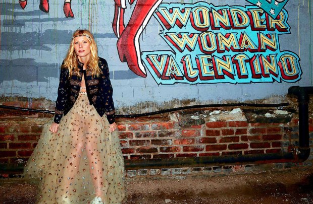
Valentino x Goop: Only Somewhat Super

gwyneth-palthrow_goop_valentino_main

This week, Goop announced a collaboration with Valentino on a Wonder Woman-themed capsule collection. Comprised of 25 pieces ranging from sneakers to gowns, this collaboration is a great coup for Goop – Valentino is by far the highest-profile label Goop has ever partnered with, and Goop can also boast the distinction of being Valentino’s first-ever partnership with an outside label.

The brand pairing is excellent – the major fashion house will boost the much-derided Goop’s credibility, while working with Goop will reinforce the Chiuri and Piccioli-helmed Valentino as being youthful and not without a sense of humor. The Wonder Woman theme is incredibly random, but cute and apropos of the current feminist conversation, as well as an in-on-the-joke move aimed at Paltrow’s critics.

It seems like the perfect partnership – the resulting product, however, is mixed.

The pieces are genuinely stunning in person (I had the pleasure of visiting the Goop Pop-up store in New York yesterday) and beautifully constructed. But the price points are too high even for Goop’s altitudinous norm, with t-shirts and sneakers coming in at about $1,000 apiece, and a leather jacket for $10,000. The gowns, though, are truly special and worth the 5-digit price tags.  Many of the pieces are also hard to wear or too novelty for everyday use, like the star-spangled denim hotpants, the similarly-decorated denim jumpsuit, and the completely sheer t-shirt. If Goop and Valentino were going to pursue these price points, they ought to have incorporated at least a few simpler pieces that would be worth the investment But then again, Valentino isn’t exactly known for its practicality – every piece is something special.

The collection seems to be doing well, with several pieces having already sold out just two days after the line’s debut. Apparently the price points haven’t been too much of a deterrent for online buyers, though most of the women in the pop-up store cast one frightened look at the Valentino rack and hightailed it to the more budget-friendly cosmetics section. Price points more akin to Valentino’s Red collection would have been much more accessible – and would have sold out immediately. Or at least caused a reaction more similar to the opening for Balmain x H&M, and less like white ladies nervously eyeing a $1,000 crown.

I certainly hope to see more high-profile collaborations with Goop and even a brick-and-mortar store in the future. Gwyneth should leverage her celebrity friendships to this end. Could Tom Ford x Goop be next? The world might explode – or at least mine certainly would.

Label Consolidation and British Stars on Trampolines: This Week In Burberry News

https://www.youtube.com/watch?v=961k-cHjMLk

Last week, Burberry announced their decision to roll up all of their lines – Brit, London, and Prorsum – into one label. Henceforth, everything will be known as simply “Burberry.”

This decision follows similar moves other luxury labels have recently made to get rid of their “junior” lines: D&G and Marc by Marc Jacobs have both became defunct in the last year. Burberry’s consolidation is much more akin to Victoria Beckham’s swallowing up the lower-priced Victoria, Victoria Beckham (although London couldn’t exactly be seen as a junior line, pricewise).

Does this make sense from a business perspective? I suppose. To the untrained shopper, the different labels might be confusing. But I think Christopher Bailey ought to have cut out London, and kept Brit and Prorsum as bookending collections – but perhaps this is my own sentimentality talking.

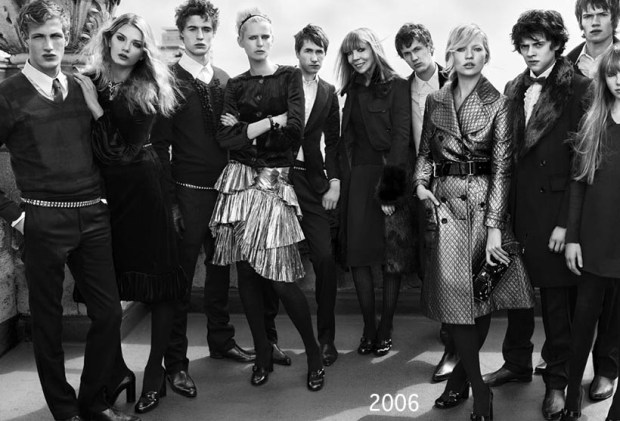
When I was first discovering fashion, Burberry was the brand I deeply identified with, soul-loved. I obsessed over it; the black and white ads covered my walls (and still do in my childhood bedroom); I finally felt like a world understood me and my interests and tastes and aesthetics. I would look at the Brit line on Nordstrom.com and think that one day I might be able to afford a piece. I contented myself with the fragrances (this was a pre-Burberry Cosmetics era – imagine!) and then one day, at sixteen, I garnered the nerve to go into a Burberry store with my mother. There was a black eyelet cotton Brit dress on sale. We bought it. It was an important psychological shift for me – I finally owned a piece of the world I wanted to live in. I was me. And I would go on to make wonderful memories whist wearing that dress, and it’s something I will keep forever. Brit’s differentiation from the other Burberry price points made that possible.

Besides my maudlin affection for the Brit line, Bailey should keep it because it’s so distinctive from the runway collections. Brit is made up of classic pieces, like sweaters and polos, starting at about $300, and usually incorporate the house’s logoistic check pattern. It’s a starter line that’s clearly identifiable as Burberry for those who don’t have the budget to afford the higher-priced London line, or a penchant for a pastel trench coat from the Prorsum collection. Without the identifying nomenclature, I feel like Burberry’s enormous inventory will be difficult to navigate, and perhaps turn away new-to-fashion buyers, who only see thousand-pound dresses and leave, unaware that they can afford something less pricey.

And as for Prorsum – Latin for ‘forward’ – that designated the high-fashion runway collections, well that’s a shame to lose. It’s a word that evokes the Burberry knight, and Burberry’s unique ability to move forward stylistically while still remaining a heritage brand. Not to mention its erudition factor – it also brings to mind a romantic vision of Oxford and Cambridge. Something like this, which, coincidentally, is the aforementioned wall décor:

2006-1.jpg~original

I’m sure Bailey has good reason for the roll up – I trust him and his vision for the brand, even though I wish he wouldn’t make this particular move. So who’s next to streamline their label? Kors won’t – yet. There’s too much of a price gap between Michael, Michael Kors and the Michael Kors Collection, and besides, he should want to keep the two separate to placate both the label-toting suburbanites loonies with brand ownership, and the starlets he dresses on the red carpet with a non-embarrassing connotation. Armani won’t yet either. There will always be a Eurotrash market for Armani Exchange on one hand, and a market for sophisticated actors to wear his suits on the red carpet on the other. How are these label stratifications even part of the same brand? They are so antithetical – not at all like Burberry’s or even Marc Jacobs’ lower-priced lines, which simply reflect(ed) the larger brand at a lower price point. I suppose a powerful name can code for a lot of different things to different audiences – but I’m not sure that’s a compliment to Mr. Kors or Mr. Armani.

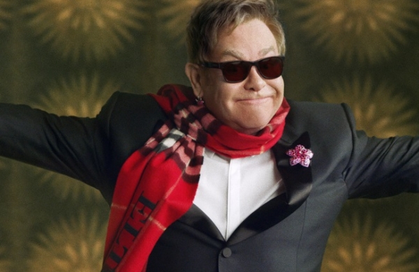
Burberry also debuted its holiday video advert last week. No luxury label does holiday marketing quite like Burberry, and the label delivered once again, with a star-studded tribute to Billy Elliot, with appearances by Romeo Beckham, Elton John, Julie Walters, Rosie Huntington-Whitely, George Ezra, Naomi Campbell, Michelle Dockery, and James Cordon, just to name a few. That’s what’s so special about Burberry – all of these faces perfectly fit the label. It doesn’t matter if you’re male or female, black or white, 13 (Beckham) or 68 (Sir Elton), Burberry is for everyone. They consistently strike a unique pitch of inclusiveness, while still maintaining luxury, aspirational status. Perhaps that’s the heritage factor, but I’d chalk it up to a special British alchemy.

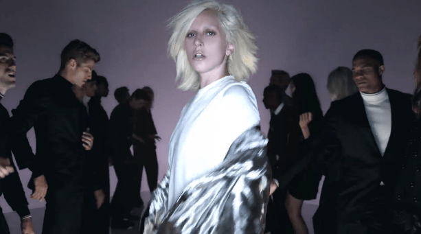
Ford on Film: The Real Meaning of the Tom Ford S/S ’16 Video

Lady-Gaga-for-Tom-Ford-SS16-Fashion-Music-Video-The-Dapifer

Allow me to begin by by saying just how deeply I love Tom Ford. I often dream about him. I would take a bullet for him. I am frequently washed over with a nausea-like feeling of deep jealousy of Richard Buckley.

Which is why gives me great displeasure to say that I did not remotely like or understand why Mr. Ford decided to show his Spring/Summer 2016 Womenswear collection in a three-minute video format.

In the Nick Knight-directed video, models disco down a runway and are cheered on by other dancing models in the frow, as it were. Quick cuts and high-energy movement give it a music video feel. Lady Gaga shows up and the dancing continues. I walked away feeling dizzy, wondering what exactly I had just watched – it certainly did not have the usual sexy, mysterious, over-the-top Tom Ford Feel.

Videos are nothing new for fashion shows. Most designers livestream their runway shows, allowing people around the world to watch in real time. This is a fantastic and democratizing tool for fans, bloggers, and buyers, who can experience the show firsthand, and not rely solely on still photos or critics’ commentary. However, the short video format Mr. Ford implemented for S/S ’16 simply is not an effective media for viewing a fashion show. The focus is entirely on mood which, granted, is important, but the viewer walks away with no recollection of what the clothes looked like – a factor that will certainly prove problematic when it comes down to pre-ordering and retail. And then, there’s the missed opportunity. Mr. Ford is one of the great showmen of our time. He is the king of spectacle, masterful at setting a scene and manipulating an audience (see: deep carpet of rose petals falling from the ceiling at F/W 2015), and deeply obsessive about his work. Why would he pass up this opportunity to display his showmanship, and instead send out something that felt last-minute?

The choice to make a video likely mirrors where Mr. Ford is creatively. He is about to start filming his second film, Nocturnal Animals, and is likely deeply ensconced in the medium of film. The video is more likely in reaction to the film project—perhaps he simply didn’t have the time to produce a sumptuous live show because of his other creative endeavors.

Then there is the alarming issue of Lady Gaga’s presence. Why she was cast as the face of this video initially seems unfathomable, as she has been musically and culturally irrelevant for some time now, and doesn’t espouse the Fordian ideals in the way that, say, Carine Roitfeld and Rihanna do. If Mr. Ford was looking for a new face for the S/S Campaign, he should have gone with Lucky Blue Smith, who also makes a cameo in the film. Having a male model front the womenswear campaign would have been edgy and in line with the current androgynous movement, and Lucky Blue has that special charismatic Ford Factor that Gaga lacks. However, as Lucky Blue is relatively unknown outside the fashion world, and the collection is already forgettable because of its format, it makes sense that the label would go with a universally known celebrity to front the campaign. Choosing Gaga was more of a necessary strategic, and not an artistic, decision due to the video format.

Although Ford’s video format was well received by the media, it is doubtful that it will become a trend in fashion shows. The short film makes the pieces forgettable, lacks a sense of drama and narrative, and distorts brand identity. The best place for videos in fashion are for marketing purposes—setting a scene, depicting a short narrative, and ultimately reinforcing the brand’s meaning. Prada does an especially good job with this, and Dior is beginning to break into the medium as well (Miss Dior and Dior Addict fragrances have been making fantastic videos for the last five years or so). Burberry smartly has an “Acoustic” music video channel, featuring independent British acts performing exclusive sets for the brand, which reinforces the cool, youthful, Britishness that Burberry promotes. Even Ford has used this format to promote his cosmetics, both for the Lips & Boys collection and the men’s skincare line, to great effect — which is why his fashion show video was such a disappointment.

What Ford’s video really makes me wonder is if he’s getting ready to leave fashion again. I’m still suffering from abandonment issues from when he took a break to make A Single Man in the late aughts. I’m afraid he’s going to go out one Sunday morning to buy a wide-lapel jacket and never come back. Ford’s true skills lie in creating a world, a brand, and his obsessive attention to detail and instincts in setting a mood serve him well here whether he is making a collection or a film. I think it’s fantastic that he’s pushing himself creatively to explore new media and put his extraordinary eye to good use, but I’m not ready to see him go from the fashion world. I’m afraid this S/S ’16 womenswear video is indicative of Ford hedging his bets, deciding between continuing as a designer, or pursuing filmmaking or other artistic endeavors, perhaps even full-time.