Naomi Campbell

Report Card: S/S ’16 Ad Campaigns

The new ads are in, and the results are not great my friends. Brands and spokespeople were mismatched, art direction was lackluster, and ads had a somber quality to them, perhaps stemming from the recent upheaval in the industry and the hit that the luxury markets have taken in China. Let’s discuss.

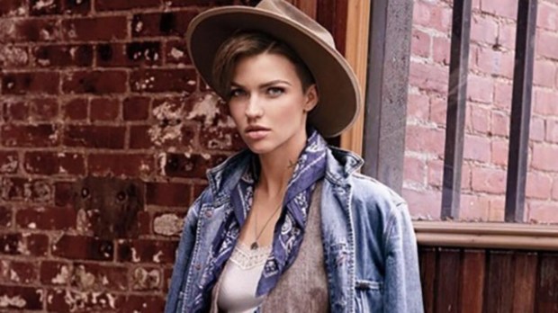
Ruby Rose for Ralph Lauren Denim Supply
640_ruby_rose_hailey_baldwin_ralphlauren_010615.jpg

Oh. Oh dear. This keeps eliciting laughs from me. I know Ralph Lauren is under new management and in desperate need to project a younger, cooler image (may I remind you that Ralph Lauren is a major sponsor of Masterpiece Theatre). It’s like they watched The Grapes of Wrath  on a TV with poorly-operating antennae, put on a blindfold, and threw a dart at a young celebrity that codes for cool and edgy. This is a tragic mismatch, and the result is schadenfreudeish. The corresponding video is even worse, bringing this depression-era Madewell shopping spree to life — the only redeeming quality of the digital component is the presence of a hedgehog.

Who would be a better face of Ralph Lauren (providing there’s better art direction)? It’s tough to say, seeing how this big brand has become amorphous and bloated by offshoot lines in the past ten years. I would go for an all-American face, like none other than Lauren Bush Lauren. She’s close to the brand, yes, but she’s an accomplished social entrepreneur with ties to two American dynasties — and Ralph Lauren is all about living the American dream. And if Tom Ford can star in his own campaigns, LBL can advertise for her in-laws.

Grade: D


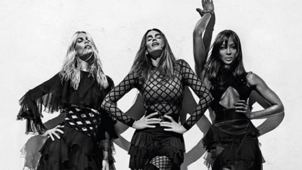
Claudia Schiffer, Cindy Crawford, and Naomi Campbell for Balmain
dynamic_resize.jpeg

This is great. It’s all the glamour and drama associated with Balmain, but without the off-putting high-maintenance flashiness. The black and white is subdued, and a nice departure from the garish colors that we’ve seen from Balmain recently, but there’s so much movement that it’s still electric — Cindy’s face and body is exquisite here.

Choosing the original Supers to font this campaign was a great move, because it capitalizes on 90’s nostalgia, and restores some sophistication to the brand after last season’s Jenner sisters ad. It’s also nice in conversation with the Balmain x H&M campaign, which featured the “Supers” of today, Gigi, Kendall, and Jourdan, whose looks mirror those of Claudia, Cindy, and Naomi.

Grade: A-


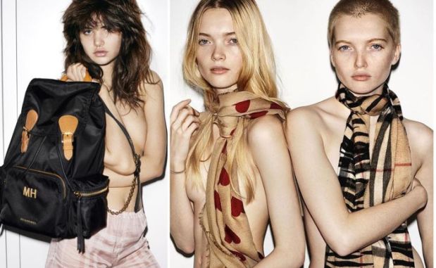
Assorted Teens for Burberry 
burberry-1.jpg

Burberry is catering to a younger crowd with this campaign, with its choice of up-and-coming young models like Ruth and May Bell and Dylan Brosnan, its debut of Snapchat (why?), and the grittier aesthetic portrayed here with a Juergen-y high-exposure flash. This makes sense, given that Burberry’s sales were down the last quarter, and Christopher Bailey has been under pressure to prove himself as CEO. Digital innovation under his guidance got the brand to where it is today, so it’s natural that he would double down on this strategy when he’s feeling the heat.

I’m not sure this is the right tack, however. It’s incredibly alienating to more sophisticated buyers and cheapens the brand’s heritage history by making it seem young and ephemeral. Although it’s important to stay relevant to a younger demographic, teenagers aren’t the group with the purchasing power Burberry needs. They need to keep their messaging consistent with what they did in their holiday campaign, and sell aspirational, inclusive, glamorous, British sophistication, which is what they do best.

Grade: C-


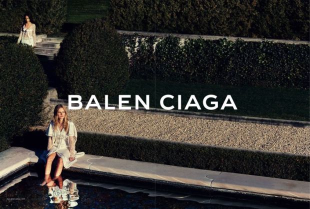
Zoë Kravitz and Anna Ewers for Balenciaga
balenciaga-zoe-kravitz.0.jpg

Finally! Someone took my advice and put Zoë Kravitz, intriguing chameleon of cool pedigree, in an ad campaign. I love the sleepy, romantic panned out shot of the two women, but the close-up shots are empty, uninteresting, and tell me nothing about the brand.

This is not a great way for Alexander Wang to end his short legacy at Balenciaga — this looks hastily done and doesn’t come across as a thoughtful farewell. If he were going to cop out, he ought to have shot Kravitz holding the Le Dix bag and called it a day. (Does anyone know if the label will continue to make these post-Wang? If not, I’ll need to acquire a loan immediately.)

Grade: C-


Label Consolidation and British Stars on Trampolines: This Week In Burberry News

https://www.youtube.com/watch?v=961k-cHjMLk

Last week, Burberry announced their decision to roll up all of their lines – Brit, London, and Prorsum – into one label. Henceforth, everything will be known as simply “Burberry.”

This decision follows similar moves other luxury labels have recently made to get rid of their “junior” lines: D&G and Marc by Marc Jacobs have both became defunct in the last year. Burberry’s consolidation is much more akin to Victoria Beckham’s swallowing up the lower-priced Victoria, Victoria Beckham (although London couldn’t exactly be seen as a junior line, pricewise).

Does this make sense from a business perspective? I suppose. To the untrained shopper, the different labels might be confusing. But I think Christopher Bailey ought to have cut out London, and kept Brit and Prorsum as bookending collections – but perhaps this is my own sentimentality talking.

When I was first discovering fashion, Burberry was the brand I deeply identified with, soul-loved. I obsessed over it; the black and white ads covered my walls (and still do in my childhood bedroom); I finally felt like a world understood me and my interests and tastes and aesthetics. I would look at the Brit line on Nordstrom.com and think that one day I might be able to afford a piece. I contented myself with the fragrances (this was a pre-Burberry Cosmetics era – imagine!) and then one day, at sixteen, I garnered the nerve to go into a Burberry store with my mother. There was a black eyelet cotton Brit dress on sale. We bought it. It was an important psychological shift for me – I finally owned a piece of the world I wanted to live in. I was me. And I would go on to make wonderful memories whist wearing that dress, and it’s something I will keep forever. Brit’s differentiation from the other Burberry price points made that possible.

Besides my maudlin affection for the Brit line, Bailey should keep it because it’s so distinctive from the runway collections. Brit is made up of classic pieces, like sweaters and polos, starting at about $300, and usually incorporate the house’s logoistic check pattern. It’s a starter line that’s clearly identifiable as Burberry for those who don’t have the budget to afford the higher-priced London line, or a penchant for a pastel trench coat from the Prorsum collection. Without the identifying nomenclature, I feel like Burberry’s enormous inventory will be difficult to navigate, and perhaps turn away new-to-fashion buyers, who only see thousand-pound dresses and leave, unaware that they can afford something less pricey.

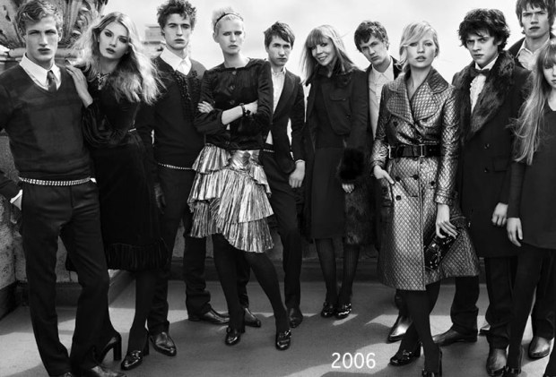
And as for Prorsum – Latin for ‘forward’ – that designated the high-fashion runway collections, well that’s a shame to lose. It’s a word that evokes the Burberry knight, and Burberry’s unique ability to move forward stylistically while still remaining a heritage brand. Not to mention its erudition factor – it also brings to mind a romantic vision of Oxford and Cambridge. Something like this, which, coincidentally, is the aforementioned wall décor:

2006-1.jpg~original

I’m sure Bailey has good reason for the roll up – I trust him and his vision for the brand, even though I wish he wouldn’t make this particular move. So who’s next to streamline their label? Kors won’t – yet. There’s too much of a price gap between Michael, Michael Kors and the Michael Kors Collection, and besides, he should want to keep the two separate to placate both the label-toting suburbanites loonies with brand ownership, and the starlets he dresses on the red carpet with a non-embarrassing connotation. Armani won’t yet either. There will always be a Eurotrash market for Armani Exchange on one hand, and a market for sophisticated actors to wear his suits on the red carpet on the other. How are these label stratifications even part of the same brand? They are so antithetical – not at all like Burberry’s or even Marc Jacobs’ lower-priced lines, which simply reflect(ed) the larger brand at a lower price point. I suppose a powerful name can code for a lot of different things to different audiences – but I’m not sure that’s a compliment to Mr. Kors or Mr. Armani.

Burberry also debuted its holiday video advert last week. No luxury label does holiday marketing quite like Burberry, and the label delivered once again, with a star-studded tribute to Billy Elliot, with appearances by Romeo Beckham, Elton John, Julie Walters, Rosie Huntington-Whitely, George Ezra, Naomi Campbell, Michelle Dockery, and James Cordon, just to name a few. That’s what’s so special about Burberry – all of these faces perfectly fit the label. It doesn’t matter if you’re male or female, black or white, 13 (Beckham) or 68 (Sir Elton), Burberry is for everyone. They consistently strike a unique pitch of inclusiveness, while still maintaining luxury, aspirational status. Perhaps that’s the heritage factor, but I’d chalk it up to a special British alchemy.