Holiday

Report Card: Holiday Ad Campaigns

Tis the season for holiday ad campaigns! Stars! Mistletoe! Enthusiasm! Here’s the how they stack up.
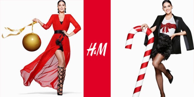
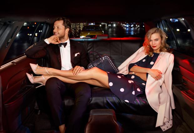
KATY PERRY H&M

Katy Perry for H&M
Oh. well. Okay.
I cannot fathom with any part of my intellectual consciousness why H&M chose Katy Perry to front this campaign. She irrelevant at the moment, without any new material, and has basically been off the media grid for months. Adele would have been a smarter choice, and would have caused an absolute sensation if she have appeared in the ads in spite of her media-shyness. Sadly, we are instead saddled with Perry posing with candy, yet again. I like the bold black, red, and white color scheme, but that’s the only thing this series has going for it.
Grade: D
tumblr_nxoarxYyEq1qbk8z2o1_500
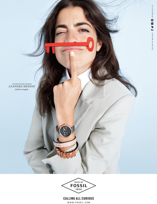
Leandra Medine for Fossil
This is a brilliant choice by Fossil. By choosing someone famous for being in fashion to front the campaign, Fossil is sending a signal that they know what’s relevant in fashion culture, which will cause fashion-forward people to look twice at what they thought was a nonbrand found only in outlet malls. Leandra is someone known for her personal style, which associates individuality and personalization with Fossil, and not just tragic leather goods and watches.She’s shrewd, sardonic,and authentic, and you can guarantee she wouldn’t do this campaign if she didn’t believe in it, adding another layer of credibility. Wear fossil, become a chic, witty, fashion businesswoman? I’ll take it.
Grade: A
Fred Armisen & Carrie Brownstein for Old Navy
Old Navy, in a move of unutterable genius, tapped Portlandia duo Fred Armison and Carrie Brownstein for a holiday short videos. I thought Old Navy was ready to be stuck with a fork when its CEO left to helm Ralph Lauren, but they have, with this casting choice, reinvigorated their relevancy with awareness of the cool, informed, media culture and a sense of humor. Will this help Old Navy compete with fast fashion? Well there’s the problem — Old Navy’s content isn’t good or fashionable enough to really do damage to fast-fashion chains, who clearly don’t rely on advertising to sell their clothes  (see evidence above). It will, however, get Old Navy back in consumers’ consciousness. What they really need is a cult item that will get people back in stores, like their early 2000s flag tees or mid 2000s madras craze, and then integrate cool capsule collections and a fast fashion business model, at least in part, to keep them there. But at the moment, this is a great step in the right direction.
Grade: A+

Kate Spade Aces the Holiday Campaign

MTMzOTA0NTIwOTk5NjM4Mjkw

Kate Spade has created another winning advertising campaign with their holiday series, starring Karlie Kloss and Derek Blasberg. A handful of others feature in the seriees, ranging from the cool, young family who own the online store Aloha Picnic, to singer Alice Smith and her very cute toddler, to serious and black-clad literary agent Anne Borchardt.

The campaign of is made up of two photo series: a whimsical up-close portrait session with shades of Wes Anderson, and a fun, spontaneous-looking session in the back of a limo, featuring Kloss in each frame.

The ads are pitch-perfectly on brand, do a lot of work while seeming effortless. Firstly, the campaign subtly challenges the idea that Kate Spade is exclusively for young white women, by including both men and women, people of color, and includes a diverse range of ages, a brand goal that was laid out in the Miss Adventure series. Secondly, the sophisticated photography quality executed by Emma Summerton makes Kate Spade look cool, less fussy, try-hard, and girly, while still maintaining its signature sense of fun.

Kloss and Blasberg are the real stars of the campaign, though, and what a brilliant pick– the two are best friends in real life, and their chemistry and giggly rapport is evident. Using Blasberg, in particular, was an inspired move, and I can’t fathom why he hasn’t been used in advertising before now. At 33, Blasberg has written and edited for nearly every major fashion publication in existence, consulted for labels from H&M to Chanel, published two books and is currently doing a stint at Gagosian Galley. Handsome, witty, and seemingly close friends with everyone who’s anyone, Blasberg is something like the Andy Warhol or Oscar Wilde of today’s fashion set. He’s a stellar choice for the ads because the audience wants to be friends with him, have a career like his, and can’t help but having a bit of a crush on him.

I love the idea of men fronting womenswear campaigns if the brands are in perfect alignment, like Blasberg’s is with Kate Spade’s. Brad Pitt for Chanel No. 5 was a miss, but the highest profile man-for-womenswear ad to date. Men can be an even more powerful visual rhetoric for a womenswear brand than women can – the kind of man you want to be with can intensely reinforce the kind of brand you want to wear. Eddie Redmayne for Burberry will appeal to some women (me) much more than a random oiled-up Versace guy, and vice versa. I hope to see more of this. Tom Hiddleston for Belstaff! Harry Styles for Gucci! Bill Murray for Kate Spade! The possibilities are endless.

Label Consolidation and British Stars on Trampolines: This Week In Burberry News

https://www.youtube.com/watch?v=961k-cHjMLk

Last week, Burberry announced their decision to roll up all of their lines – Brit, London, and Prorsum – into one label. Henceforth, everything will be known as simply “Burberry.”

This decision follows similar moves other luxury labels have recently made to get rid of their “junior” lines: D&G and Marc by Marc Jacobs have both became defunct in the last year. Burberry’s consolidation is much more akin to Victoria Beckham’s swallowing up the lower-priced Victoria, Victoria Beckham (although London couldn’t exactly be seen as a junior line, pricewise).

Does this make sense from a business perspective? I suppose. To the untrained shopper, the different labels might be confusing. But I think Christopher Bailey ought to have cut out London, and kept Brit and Prorsum as bookending collections – but perhaps this is my own sentimentality talking.

When I was first discovering fashion, Burberry was the brand I deeply identified with, soul-loved. I obsessed over it; the black and white ads covered my walls (and still do in my childhood bedroom); I finally felt like a world understood me and my interests and tastes and aesthetics. I would look at the Brit line on Nordstrom.com and think that one day I might be able to afford a piece. I contented myself with the fragrances (this was a pre-Burberry Cosmetics era – imagine!) and then one day, at sixteen, I garnered the nerve to go into a Burberry store with my mother. There was a black eyelet cotton Brit dress on sale. We bought it. It was an important psychological shift for me – I finally owned a piece of the world I wanted to live in. I was me. And I would go on to make wonderful memories whist wearing that dress, and it’s something I will keep forever. Brit’s differentiation from the other Burberry price points made that possible.

Besides my maudlin affection for the Brit line, Bailey should keep it because it’s so distinctive from the runway collections. Brit is made up of classic pieces, like sweaters and polos, starting at about $300, and usually incorporate the house’s logoistic check pattern. It’s a starter line that’s clearly identifiable as Burberry for those who don’t have the budget to afford the higher-priced London line, or a penchant for a pastel trench coat from the Prorsum collection. Without the identifying nomenclature, I feel like Burberry’s enormous inventory will be difficult to navigate, and perhaps turn away new-to-fashion buyers, who only see thousand-pound dresses and leave, unaware that they can afford something less pricey.

And as for Prorsum – Latin for ‘forward’ – that designated the high-fashion runway collections, well that’s a shame to lose. It’s a word that evokes the Burberry knight, and Burberry’s unique ability to move forward stylistically while still remaining a heritage brand. Not to mention its erudition factor – it also brings to mind a romantic vision of Oxford and Cambridge. Something like this, which, coincidentally, is the aforementioned wall décor:

2006-1.jpg~original

I’m sure Bailey has good reason for the roll up – I trust him and his vision for the brand, even though I wish he wouldn’t make this particular move. So who’s next to streamline their label? Kors won’t – yet. There’s too much of a price gap between Michael, Michael Kors and the Michael Kors Collection, and besides, he should want to keep the two separate to placate both the label-toting suburbanites loonies with brand ownership, and the starlets he dresses on the red carpet with a non-embarrassing connotation. Armani won’t yet either. There will always be a Eurotrash market for Armani Exchange on one hand, and a market for sophisticated actors to wear his suits on the red carpet on the other. How are these label stratifications even part of the same brand? They are so antithetical – not at all like Burberry’s or even Marc Jacobs’ lower-priced lines, which simply reflect(ed) the larger brand at a lower price point. I suppose a powerful name can code for a lot of different things to different audiences – but I’m not sure that’s a compliment to Mr. Kors or Mr. Armani.

Burberry also debuted its holiday video advert last week. No luxury label does holiday marketing quite like Burberry, and the label delivered once again, with a star-studded tribute to Billy Elliot, with appearances by Romeo Beckham, Elton John, Julie Walters, Rosie Huntington-Whitely, George Ezra, Naomi Campbell, Michelle Dockery, and James Cordon, just to name a few. That’s what’s so special about Burberry – all of these faces perfectly fit the label. It doesn’t matter if you’re male or female, black or white, 13 (Beckham) or 68 (Sir Elton), Burberry is for everyone. They consistently strike a unique pitch of inclusiveness, while still maintaining luxury, aspirational status. Perhaps that’s the heritage factor, but I’d chalk it up to a special British alchemy.